A METAPHOR FOR LIFE (updated)

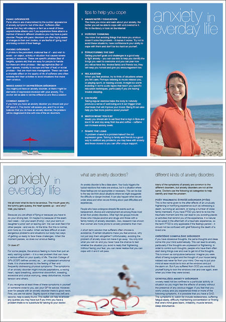
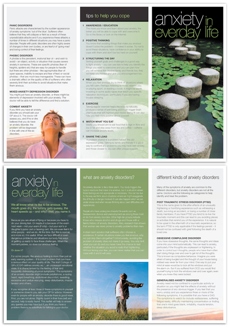
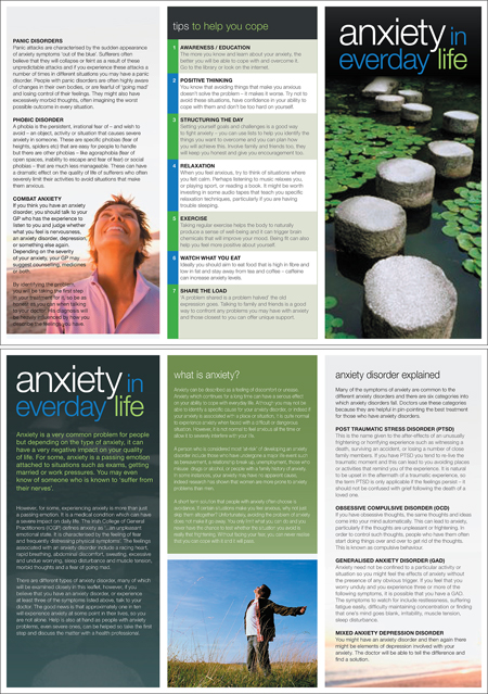
REMEMBER THAT ANXIETY BROCHURE I did in my first week of Climate? Well the client has FINALLY come back with some minor changes. Aside from the text changes there was a total redesign needed. Hmmm. Am I becoming a designer that I never wanted to be? Or am I getting better? Worse? WHO KNOWS?
Also the Angle Books arrived today: TOTALLY COOL!
IESSO
_________________________________________________________________________________
UPDATE:
The anxiety brochure is making me crazy! The client hates the beach theme, apparently it reminds them of holidays. OH NO! Not a calm, relaxing holiday! Thats the LAST thing someone with stress needs. Anyway they MADE me use images of stepping stones (Ranked No.3 on the list of image cliches [a close third behind (1) Relay batons being passed and (2) People of different races shaking hands, and directly ahead of vector butterflies, money with people with goofy expressions and puzzle/maze analogies!]) HOORAY!
Its funny that this brochure which is supposed to help people does so much harm to the first person who see's it (me). It's all downhill from here!


2 comments:
Woops. Good thing you're still watching my type-back. I'll fix those up when I make changes. Yeah, awkward type is what I'm all about!
Yeah that is funny isnt it? Wait, no, it hurts my soul. For you see (boys and girls) the very first design I did was green and browns. My boss said it was too green. I did a blue one, he loved it. The client said it was too depressing. Now we're back here at green again. And my boss has given me a hard time about it the whole way! HUZZAH! <[*_*]>
Post a Comment