Monday, October 31, 2005

TRICK OR TREAT? or forget...

jackolantern

HAPPY HALLOWEEN BOILS AND GHOULS. I actually totally forgot it was Halloween. I normally am much more focused on this holiday because of the: 1. Candy 2. Little kids dressed up 3. Holding onto my Americanisms 4. I get to dress up.

Actually ignore #2. But this year I totally had other things on my mind. Which is sucky. I don't like this whole 'uni' thing anymore. It's taking up too much of my time and energy. It sucks butt. That's right; BUTT.

IESSO

OH HAPPY DAYS

offset_bsp02

One of my happiest days in my memory was when I was about 5 or 6 and I went to Toy-R-Us with my mom and I got a $2.99 Lego space man set. I remember it vividly. It was this set here. I remember my mom telling me to wait untill I got home before I opened it in case I lost one of the peices. Of course I didn't listen, opened it, lost one of the peice but it didn't matter. They used to include a few extra peices of the ones you'd lose easiest. I wonder if they still do that? I also remember hating that set a few years later because it was old and therefore not cool anymore. I smashed it all up so I wouldn't confuse the parts with the new ones.

Now I wish I didn't. I tried to find it the other day, and only found a dented helmet and the long since worn away body. Kind of sad I guess. A metaphor for youth? When you're young you hate it, now that you're not, you regret hating it and yearn for it again. Or maybe not.

But if anyone is thinking of giving me a really thoughtful and generous gift, HINT HINT.... you can buy them on eBay for about $0.99. I saw one set for 1 pence.

IESSO

PS. It says 1979 in the copyrights, but I don't know about that. I remember buying this set, it must have been about 1988 or 1989...

GOOD RIDANCE TO BRIGHT RUBBISH

Well the great yellow-blog debarcle of 05 is now officially over. After some intense complaing from a certain someone (who's name I won't mention, let's just call him Underscore) I've changed to color back to something more soothing. Not actually soothing, just more soothing. Still going full steam ahead with the bright colors, just not so bright. Anyway I'm not bitter about the forced color change, it's worth it; Li... oops, ... Underscore is gonna help me with my Flash assignment, being my portfolio, so that would be cool. And it is yellow, so in case there are some yellow fans out there, feel free to rejoice.

As well as getting rid of the yellowness, Linus got rid of his sucky wiki (or sucki) after much complaing from a certain me. He promises to have not given up on finding the perfect list-based blog, but we all know he'll give up sooner or later. :)

IESSO

Saturday, October 29, 2005

SHIFT_you're an ass

Constanza

Linus thinks he cool with his wiki page. His list about me is particularly clever, well thought out and just generally accurate. My rebuttal is as follows:

Why Linus Bowman is a stupid-head.
1 He has a head, which is stupid.
2 He likes PC's. STUPID!
3 He thinks that smoking isn't cool.
4 His name is a thumb-sucking 5 year old friend of Charlie Brown
5 My blog has more readers than his 3 blogs and wiki, combined!

Friday, October 28, 2005

THAT'S RIGHT, YOU HEARD IT HERE FIRST FOLKS

PB-Sale

I'm selling the legacy. She's up for sale. I need to find her a good home. If you want her, or know someone who would, AND promise to be nice to her, feed her everyday, walk her and clean up her poop, let me know. The price is a bit negotiable, but not much. I'd like the full amount actually. BUT you do get an iPod 20GB to sweeten the deal.

It's gonna be a highest bidder or whoever offers first or is easiest delivery type deal. I haven't worked that out yet. GOOD LUCK

IESSO

PS. Unfortunately if you need the laptop immediately it isn't for sale just yet. In about a week it will be made availible. Consider this a teaser campaign or something. Generating interest...

HUZZAH!

Hey there guys. That's right THIS IS mondayne. It's just got a bright new color scheme and typestyle. HOORAY mediocrity at its best! Anyway nothing else is new. So feel free to leave now.

D3RM0'S BIRTHDAY!

Happy-B-Day-Dermo

I want to wish one of my closest and bestest friends DERMOT a very happy birthday! So here goes; HAPPY BIRTHDAY DERMOT! I hope you have an awesome party even though I'm not there so it will be sucky, but nonetheless TRY to have loads of fun, get nice and drunkened, make a fool of yourself and if possible make out with as many chicks as you want.

I'm Elliott Scott, wishing OUR friend Dermot all the best, signing off.

PS. If you wanna wish Dermoid a happy b-day, post a comment. Ah go on, you know you want to. PLUS he reads this site once in a while, so you just know he's gonna appreciate the lovin'.

PPS. I'm not sure if he's sensitive to the number or not, so don't mention how old he is. Some people are shy about that kind of thing. Although I don't know why. It's not like he's 40 or anything....

PPS. His birthday was yesterday the 28th. I only got home at midnight so I couldn't put this up in time. BUT it's still his birthday in Ireland (which is where he lives) so that's gots to count for something. Shirley?

Thursday, October 27, 2005

A JORB WELL DONE

PortfolioSPREAD

OK GUYS, I've done my folio, so I promise to stop pestering you with infrequent and boring updates. Instead I'll be returning to the usual crap; me whining, stupid stuff that happens, and my friends acting like idiots. HOORAY

Monday, October 24, 2005

WORST (best) ONE-LINER EVER!

TANNER: Are you kidding me, that guy is more camp than Auschwitz...

Sunday, October 23, 2005

MOBY vs THAT GUY FROM R.E.M.

Mobii

I only have one more thing to do, and then I'm done with the folio. So luckily it'll be business as usual on the blog again. HOORAY!

IESSO

PS. If you want to read the 'features' of the 'phone' go right ahead, they're quite stupid.

Saturday, October 22, 2005

ACTUAL POSTS?

1. JUST A THEORY

Went shopping with my parents today, at the NEW Helensvale Shopping Centre... it's a nice enough mall, a bit too nice for Helensvale but that's another story. Anyway when we were there I gots to thinking; "How old do you have to be to not be embarrassed by your parents anymore?" I know little kids aren't embarrassed, teenagers are, and adults aren't anymore. Why is this? Are the adults mature enough to embrace our parents idiosyncrasies, or are they just not cool any more? The teenagers with their parents all had looks of horror, while the kids and adults didn't mind at all. And I realised I don't mind hanging out with my parents anymore either. Am I no longer cool? Or am I just more mature?

2. GLOW AWAY

GlowLogo

I wish this is what I did so long ago. These business cards RULE! Gotta love the 'curvey-curves'*. I'm getting nearer the end of the fortpolio, only a few things to go, then I'm ready to print! HUZZAH!

* This is a technical term, similar to 'shiny-shine' and 'mattey-matte'. It means 'die-cut' corners, but that's such a lame term. Curvey-curve is much better and much more appropriate.

3. IESSO

Glow-Funky

PS. (4.) I just bungged this idea toggether. What's the verdict? I really think it's cool, but I'm a bit hesitant to bother changing all the work I've done so I need your opinion. Do I change the old logo to this new one? Or just leave it all as is? Thanks.

PPS. (5.) Sticking with the funky writing theme, here is a fun little desktop to use and enjoy. I guess it's only good for screens that are 500x375 pixels, but hey, if you've got an old-school mac or a fancy mobile phone, feel free to steal this image to use. Or if you REALLY want it, I'll send you a larger version... for a low low fee. of course...

Chillax

Friday, October 21, 2005

OLD TIMEY

BWFCover

I've been going back over some older work, revising it, redoing it, re...gaurding? it. And I decided to completely start again with the Brisbane Writers Festival. I dunno why really.. I just am. I didn't like the old one, and I removed some stuff from the folio, so it seems fitting that I put in something else, something cool.

And I think this is cool. Shirley _someone will have problems with the typo, but that's to be expected. I like the image anyway, she's got the perfect look on her face. PERFECT! Except its a low-res image and it looks sh*tty up close, so I was considering buying it. Untill I saw the cost; US$175.00, so nevermind.

IESSO

BWF-Cover

PS. Revised version. Changed the orientation to better suit the MASSIVE amount of text. Also added the brown border to give it a more old-timey retro feel, as well as avoiding stretching the image. And changed the colors to a more faded scheme. And added the logos. So basically I'm procrastinating and avoiding doing the inside section, which has HEAPS of text. And I have no ideas on how to make it all sexy. Any suggestions?

PPS. Her name is Mrs Eaves. The perfect name for a writer, named of course after the font used: Mrs Eaves. What a coincidence?!

Wednesday, October 19, 2005

ELLIOTT SCOTT: IN 7 TROPICAL FLAVORS

Business-Card-BACK

My business card. They're 55x55mm in they're stickers! WOO-HOO!

Tuesday, October 18, 2005

SAME OLD, SAME OLD...

PortfolioColorful

I know I haven't posted anything interesting in the last few weeks, been a bit preoccupied with the portfolio. I've spent almost every waking second on it, tryin to get it just right. And for a while it was fine, but looking at it for so long, I began to hate it. The UNG suggested colored backgrounds, and OH MY GOD! It looks so much better!

IESSO

Saturday, October 15, 2005

FUN TIME IS OVER

AdobeIllustrator

Here is the LAST of the fake ads for the portfoliogazine. I now have to finish all the stuff like business cards, letterheads, all the images for the magazine, AND write the text. Then I've got to set up the impositions (the pages as they print, not as they appear) and print, bind and glue. And then I'm all done.

And after that I'm free! (not really; I've got to do 4 Flash assignments, 2 essays, a test, my resume, work for Professional Studies and that's about it) THEN I'm free!

IESSO

SIDE NOTE: Even though it's an ad for Illustrator CS2's LiveTrace feature, I didn't actually use it at all! Which is kind of stupid. The background was done in Photoshop by adjusting the layers, and the cab was drawn the normal way in illustrator. Boring, but maybe a bit interesting.

Friday, October 14, 2005

PRINTING OFFER

CanonPrinter-Offer

Hey guys, I bought a printer the other day for a measly $950! And because I'm such a nice guy (and nothing to do with the fact that it was painfully expensive) I thought I'd share it with anyone who needs to do some printing. I have to charge you a little bit though, only to cover the cost of ink, but not for usage or anything selfish like that. It's a win-win situation for both of us though; you get cheap HIGH QUALITY printing, and I recover a LITTLE of the cost of the machine and inks.

Let me know if you're interested either by:
PHONE: 0402 199 826
EMAIL: mondayne AT gmail DOT com
POST A COMMENT on the blog
TALK TO ME IN PERSON: I'll be at Liveworm most of next week. (If I'm not there) Leave a note on my desk with your phone number and a description of what you'll be printing....

Ok, good luck with the design and all. If you need to print, this is a good offer... And I'm happy for you to use it.

Elliott

IT ALL STARTED HERE

MondayneComic

I did this comic over a year and a half ago about this weird day I had. And now I'm putting it in my portfolio. A good place for it I think. Sure it may be crude, and I have done some revised versions which look and read a lot better, but it all started here. The name Mondayne came from this comic. So it seems appropriate that it's included.

If you wanna read it, good bloody luck. Even if you can read the insanely small type the order of the frames is difficult to understand like this. On the pages it makes sense though. The first chunk (top left) it page one, read left to right, top to bottom, then move to the second chunk (top right) reading left to right, top to bottom, then the third chunk (bottom left) and finally the fourth chunk (bottom right).

If you want a copy sent to you let me know. I can PDF it. The images might deteriorate a bit seeing as though I have to compress it, but you'll still be able to read it. Or else check out the portfolio in person for full Mondaynular effect.

IESSO

IT'S A BIG COUNTRY

Smoking-Ad-FLAT

Yet another fake ad for the portfoliogazine! YAY! Nearly done. All I've got to do is write the text, place a few more images, do one more ad, print and bind it and I'm done! HA HA SUCKAH!

Thursday, October 13, 2005

FAKE SMILES AND ... UM... THE BROTHER OF FRASIER'S NAME IS NILES?

Jp4-square

a-hat-so-stupid

Anyway here is the fake poster for Jurassic Park 4 and the CD reviewed 'A Hat so Stupid'. If you've got any suggestions that'd be cool. Otherwise it's 4am and I need to wake up in 2 hours so I don't really know what's what anymore.

The JP poster is what I want to see; they've got strong brand identity with the t-rex sillouette, I don't think they need to have the words "Jurassic Park" anymore. And not cheesy textures. Just simple BLACK and WHITE. There's no need for anything else. And the band is one of those generic indie-rock bands whining about their ex-girlfriend while and wishing they didn't have to study chemistry and could 'focus on their music careers' type dealies. So hence the cover.

Later peeps.
IESSO

PS. You have ggots to love the 'long-s'. That's the letter in front of the 'o' in "a Hat SO Stupid" Cool huh? So old-fashioned. And superfluous ligatures. Nothing beats that either. I just know Linus is gonna love it. Or cry. Yeah, cry. And kill me. heh heh heh. SUCKER!

Wednesday, October 12, 2005

WELCOME TO JURASSIC PARK

bday

"Hey. Thanks for taking the time to read this so called 'blog'.

I don't really have much to say, now that I've been put on the spot. I just want someone to hear this. Even though it's really nothing. But isn't that why people do this anyway? They want to be heard.

So, I guess the purpose of this blog is to tell some jokes, share some laughs, and all the etceteras. But I have a feeling it's gonna be either a lot of me whinging about crap, or I'll never post a new message again. Either way, it's a good waste of time, for both me and you.

Well thus concludes POST #1 of the Mondayne Web Log.
I'm Elliott Scott, signing off."


I wrote that one year ago. Wow. So much has changed in that year. The purpose of the blog remains much the same, but the author has changed a lot. Happy Birthday Mondayne!

ANYWAY: I got a call today from someone looking for someone to do some sketches and deisgn mock-up for their assignment. And for the first time EVER I turned them down. I have never did that before. It felt good. And a bit weird. Our little boy is all grown up!

Well thus concludes POST #479 of the Mondayne Web Log.
I'm Elliott Scott, still signing off the same way, signing off

SELF-OBSESSED? WHO... ME?!

mondayne-fashion

I'm doing a little mini-magazine to go inside the portfoliogazine dedicated to just the t-shirts I did. I'm only doing this for design accuracy and not because I'm fully self-absorbed or anything like that. Yeah right. Anyway the mini-mag looks cool enough I guess. Here is the cover. Nice and mundane. I'm not even wearing on of the shirts. HA HA! Continuity!? What the heck is that?

IESSO

PS. Sittin' in front of a bin next to Liveworm. Great coincidence about the "do not overfill" message being right next to my brain. Good stuff.

PPS. It's little Mondayne's FIRST BIRTHDAY tomorrow. He's turning 1 year(s) old. Hooray! I can't believe I made it this far. I couldn't have / wouldn't have bothered if it wasn't for all you guys and your support. Thank you so much for the encouraggement and the readership. To celebrate I have a 20GB iPod to give away to anyone who answers the following question correctly. How many times have I changed the appearance of the blog (not including profile changes, just stuff like the background, or the masthead or stuff like that) Send me your name and contact details and I will choose a winner at random. Good luck. ***A clue: It's more than once, less than a billion times. Hope that helped.

Tuesday, October 11, 2005

SO VERY PREDICTABLE

fur-poster

I was gonna write a post about not taking my meds and it making me crazy (head hurts, dizzy, etc as well as the standard relapse into depression) I'm listening to my iPod now and the playlist is a bunch of songs my ex girlfriend used to play... blah blah blah boo hoo. Anyway I was working on some images that I'm putting into the folio. I spent about 4 hours on the image above, fixing things up, makingg sure colors work all goodly and all that. And when I finished I posted it on the web. BUT instead of saving a different version I (being the complete dumbass that I am) saved over the top! now the image is only 450 pixels wide instead of the needed 2500!!!! AAAAAAAahhhhhhhhh. That is so annoying it hurts my already hurting mind.

I give up. Time to watch TV.

IESSO

Monday, October 10, 2005

A LITTLE BIT SUSS??

WRITING THE COPY FOR THE END OF YEAR CATALOGUE. ONE OF THE GIRLS WROTE THIS. WE (THE GUYS STAYING LATE) LAUGHED OUR FRIGGGIN OVER TIRED ASSES OFF. I DONT THINK SHE MEANS FOR IT TO BE SUSS, OR RATE SO HIGH ON THE LAME-O-METER, BUT IT DOES. ENJOY.


Basic arty cakes

125g butter for flexibility ^
1/2 cup castor sugar for sweetness ^
1 tspn vanilla for that something extra ******^^^^^^^^!!!!!
2 eggs for pulling together ***^^^^
1/2 cup milk for consistency
1 1/2 cups SR flour for growth
1/2 cup custard powder for design secrets ^^^^^^^^^^


Exciting cake variations

Iced - Finished with a cherry on top
Snowballs - Looks a bit spiky but there's cream inside **
Chocolate - Always provides a satisfying finish ****
Sultana - Exciting pieces throughout
Coffee - Keeps working all night *************
Butterfly - Cakes Don't let them fly away ^^

IT WOULD BE SO MUCH BETTER IF THE 'EXPLANATIONS' WEREN'T INCLUDED. BUT NO, SOME PEOPLE JUST DON'T GET IT DO THEY?

* SUSS-NESS
^ LAMITUDE

SPREAD YOUR WINGS AND FLY AWAY?

PortfolioMagCS89

PortfolioMagCS2425

PortfolioMagCS2829

PortfolioMagCS1819

Oh the was bad. Really bad. Even for my standards. Anyway sorry about the lack of posts in recent days. AND doubly sorry for not even posting anything interesting. Only the damn portfolio spreads. Oh well, I have been kinda busy. Stressed to the MAX! I bought a $950 printer today. It is the top o' the line printer. 8 ink cartidges. Green and red ink! HUZZAH!

Well I'm gonna be busy for the next few weeks too.. so don't feak out if I don't update so often. I'm not dead lying in a ditch. There's no ditches near my house! I will of course we a zombie, walking around dead.

IESSO

Saturday, October 08, 2005

AWW TO HELL WITH IT!

covers

Everyone says that the cover is most important, what with the judging the book by it and all... so you can understand why I am so nervous about designing the cover, and making sure it is me, and at the same time good. Here is what I've come up with. It seems to be the least crap one I've done so far. So that's a good thing. Plus it's got a dinosaur on it. The only problem is that it doesn't match the style on the inside, but I'm not so sure that really matters. If I do some more hipster images I can get away with having plain text layouts. Or at least I'll keep telling myself that.

IESSO

NOTHING LIKE SLANDER TO GET THE BLOOD FLOWING

Cooper

Another fake ad. for the mag. I guess it's not really that funny or anything. But it is a 'clever' way to incorporate my favourite font into the design, since I've decided not to use it for the layout.The caption down the bottom is the only mildly humourous bit. Mildly.

IESSO

Friday, October 07, 2005

BREAKING ALL THE RULES; a lesson in mundanity

Breaking-the-rules

I'm working on the portfolio. Made it less pointlessly hip, and more mundane... but intentionally so. I've also thrown out the whole concept of columns. I never liked those guys anyway... If you read the interview (which you can't at this small size) it's pretty goofy. Instead of the traditional column/image type dealie, I'm gonna use a bigg block of text, with the answer/questions defined by bold/medium weights. Oh the insanity!

I might include a transcript of anyone is interested.

IESSO

PS. I apologise for the lacklaustre screenshots tonight, couldn't be stuffed doingg it all proper like in photoshop and all. Besides you get to have a glimpse at the real excitment that is graphic design. Huzzah!

Thursday, October 06, 2005

I HEART COPYRIGHT INFRINGEMENT

Pepsi Coke

I can't sleep (despite the fact I only got 4 hours sleep the last night and I was dead tired all day. I think I'm stressed or something) Anyway to try to remedy my little sleep problem I did a little fake ad for the magazineportfolio. It turned out a lot more complex (20,000+ elements!) and took a lot longer (2.5hours) than I expected at the start. But overall I'm quite please with the results. It's silly, but not too silly, not insulting, but completely impossible and it looks cool [in my opinion]

More fake ads to come, plus fake CD's and fake movies.

I'm fake Elliott Scott, signing off

Wednesday, October 05, 2005

SLOWLY, BUT DOUBTFULLY

Portfoliogazinelliott1
subscriptions

I was really excited about my catalog/magazine/portfolio/printed blog, but now I'm starting to get scared. Its looking shitty, boring and not very well done.

Fishing for compliments? Perhaps, but I do genuinely feel aprehensive.

Also, was supposed to be finishing at Liveworm monday, then tuesday, now it looks like I won't finish till end of next week. Getting pissed off.

IESSO

Bad-Influence

PS. Went outside for a smoke. A little devil appeared on my shoulder. Such a bad influence these trolls.

Sunday, October 02, 2005

I BENT MY WOOKIE

We were watching that show: "Australia's Brainiest Kids", which is like a quiz show for children. Some of the kids just lost the latest round;
HOST: Oh well, congradulations on being in the top percent of Australia.
ME: Hmm, isn't everything in the top percent? Without specifying the number? Isn't that the whole idea of percentage?
ME (to Adam): You're in the top percent of my friends...
ADAM: I hate to tell you this but you're in the bottom percent of my friends.

IESSO

WHEN CHEESEBURGERS ATTACK

McHeartAttack

We finally managed to order a POUNDER from McDonalds. NO! Not a quarter pounder, oh no! a full pounder. 5 peices of cheese, 4 pieces of meat, 3 heat attacks and a double bypass. It was awesome.

FIRST BITE: Hmm, this is not so bad, it's actually kind of good.
LAST BITE: I want to die.

DISCLAIMER: Kids, don't try this at home. It has taken years of mental training to build up the stamina and resistant bacteria needed to digest the massive 96grams of fat included in the burger. This burger is literally not for the faint hearted. Its been three hours now since I ate and my heart is racing, I'm sweating and I generally feel horrible. But it had to be done. Whats next? The four-pounder!

IESSO

Saturday, October 01, 2005

THE BEGINNING OF THE END

TITLE-PAGE2

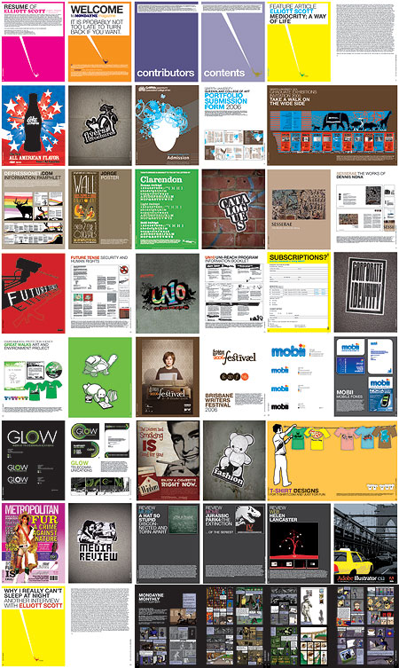
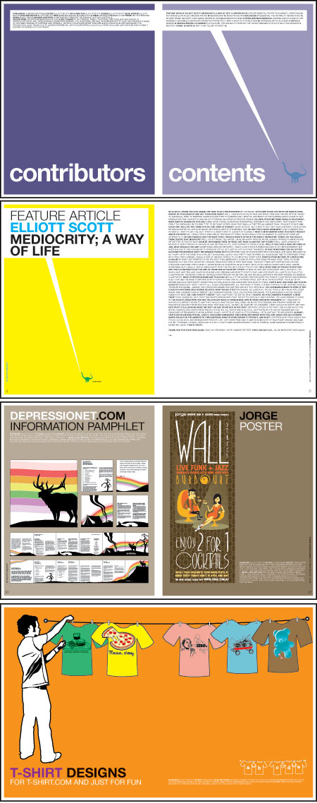
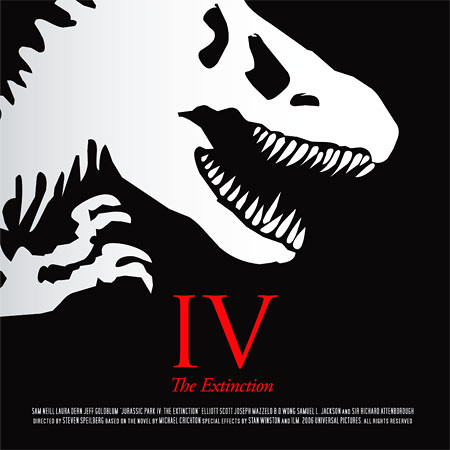
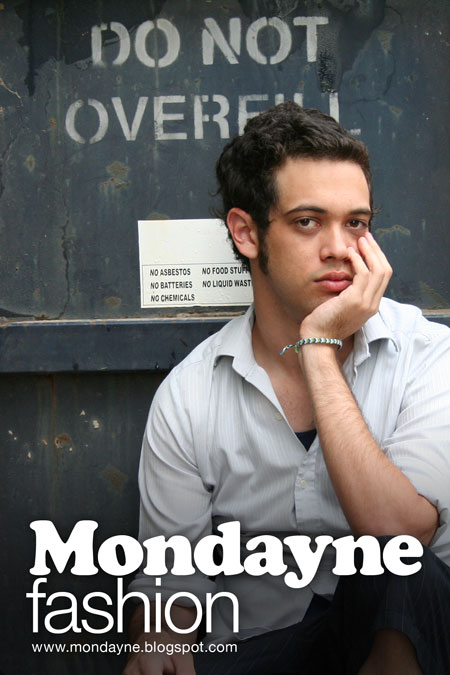
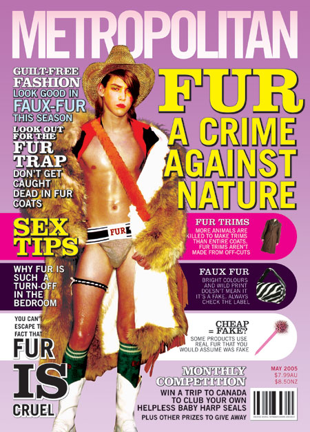
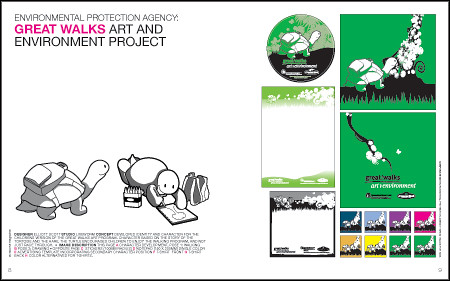
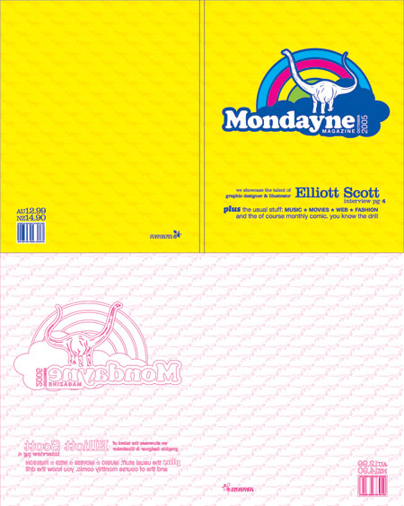
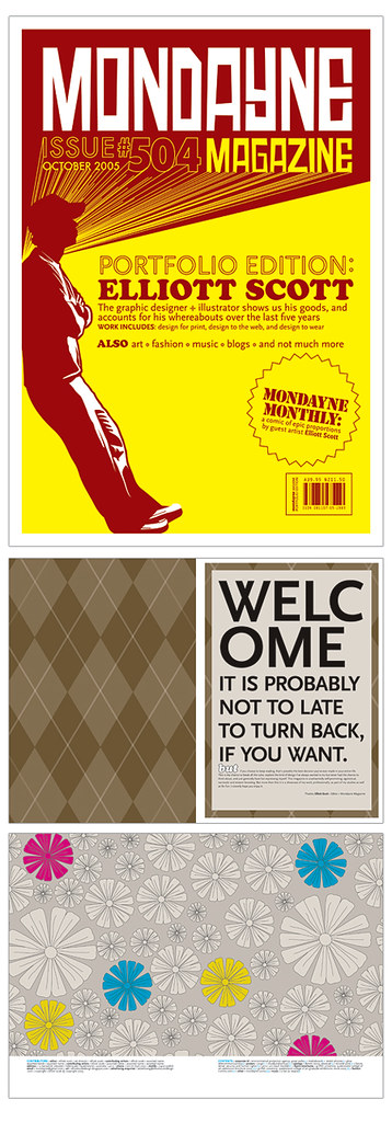
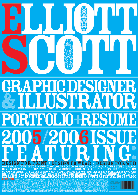
Well it's official now, we're graduating next month. In order to actually finish we've got to make this thing called a portfolio? So like, what ever that is? Anyway I think mine is gonna be a bit hip and funky, but not entirely stupid either. What I want it to say about me is: I am fun and funky, with a creative silly imagination, but who can do professional work in a tight timeframe and with an accurate eye. How I'm gonna actually say this is through a magazine style portfolio. I can have some of the work I did as advertisement style pages, some as 'articles' and some in a 'fashion' section. It will all be very tongue in cheek.

I've been thinking a lot about this: I don't want a job that is dry and boring and highly professional, I want a fun, funny, and funky job where I can be creative and develop my creative potential. Or something like that, so if I hand in a standard boring black folder it will suck, a fresh funky, egocentric magazine will surely do the trick,.... shirley?

Ok, so these next few weeks are gonna be intense! I have a F*CKLOAD of stuff to do, this magazine makes it so much harder than it needs to be, but it will hopefully be worth it.

IESSO

PS, I think I must have said funky about a zillion times in that post. Someone gimme a thesaurus quick!

FLOWERS

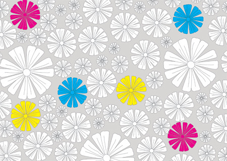
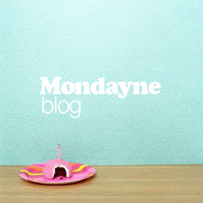
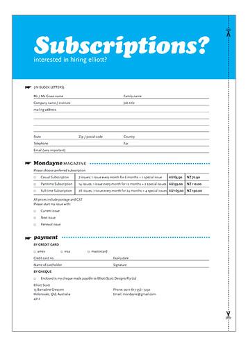
PPS. This is what the pages dividing the sections will look like. Well, this and other things like it. Not all flowers. This is only one of MANY spreads.