
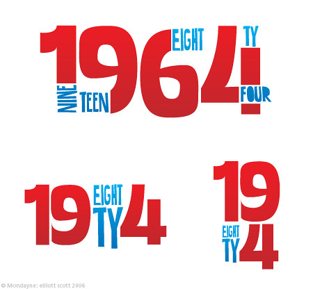
NINTEEN-8TY-FOUR
WORK HAS BEEN A BIT BORING RECENTLY, which is why I'm doing a personal project. I've been wanting to do something with 1984 for a long while, and have been working on things in the past, but without ever finishing. This time will be different though. This is going to be the best Spring Break EVER!
No but no, what happened was that I started out doing the normal futuristic Designers Republic style typography and imagery, which is great, and I totally love that look, but can't really do it, and besides, it's been done to death already. So I was just playing around and somehow found myself doing 1960's style type. Not the psychadelic stuff, more of the Saul Bass Vertigo/Dial M For Murder stuff. And it worked well that 8 and 6 look so similar. So I played around a bit more and tried cutting out the numbers and placing words in them. And then I put 'EIGHT' in the 6 and I decided I liked it.
I want to do a bunch of imagery, and indepth typographic studies, and see where this leads. No doubt it's going to be in my portfolio, if it's done, but I'd also love to get it nicely screenprinted onto posters. That'd be gorgeous.
Gimme some feedback if you want/can, I'd love to hear from you guys.
IESSO

2 comments:
WELCOME BACK!!!!
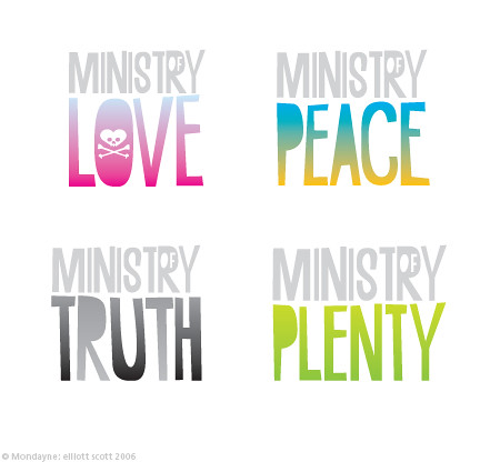
While I don't love gradients, I don't mind them either. Bottom left is the easiest to understand, but says nothing of 1964. Compressed? It's more condensed than anything, I made all the letter myself, most of them original drawings, and not reused for other words.
Hipster dinosaur font is entirely my own doing. I couldn't find a font like that so I did it myself. It's a bit clumbsy but I can replace it...
How was Melbourne?
WAIT A SECOND! You're not back at all are you? You're in an internet cafe! For shame dude. For shame. You couldn't resist checking your emails...
What would Magnum P.I. say about that? I don't think he'd be impressed. Not one bit.
Post a Comment