
FORT POLIO (UPDATED 22/10)
WORKING ON SOME STUFF FOR MY FOLIO (like the Mobii + Glow IDs), so in the next few weeks there will be more of my work. This poster is a make-up-brief as a way of getting some more color into my folio. At the moment I have for posters in there, all brown. So I needed to get some color in. I'm working on an Adidas campaign as well (just another make-up-brief).
Gimme some feedback if you can. And maybe some suggestions too....
IESSO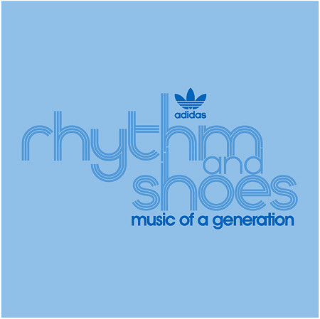
Here is a sample of the adidas thing I'm doing. It's to celebrate the 35 Year anniversary of 'The Superstar'. So it's a CD-case with some stuff and stuff. Basically I just wanted to try the type. What do _you think?
IESSO

3 comments:
Yeah, the ol' cut-across-the-verticle-composition trick might work here. I was just trying to get this idea out of my head late last night, it's actually very messy and needs a lot of work. But thanks for totally kickin' my ass and pushing me in the right direction! ^_^
Hmm ampersand huh? I'll try it. Re: White space, this is only a SAMPLE of the thing. There is plenty of white. Fear not.
What's IMO mean?
i dunno... i really like it... i think it is quite effective.
I am reading "addidas: rythm and shoes"
but im seeing "Ministy of sound: Chillout sessions"
please dont take that as an insult
it is not intentional if it is.
I really like it, then again i also like MOS.
Tanner
Post a Comment