
IT MEANS FRIEND (updated)
SO IF ONLY I HAD A BUBBLE TEA PLACE to pitch my ill-conceived, poorly executed, not worked out idea. Keep watching this space (which you already do right? RIGHT?) for further updates, better work, and maybe even something not horrible. As you might have guessed, work isn't fulfilling me as creatively as I would like, so I spend more time doing personal projects. I'd much prefer personal projects that paid me, but this is good enough for now.
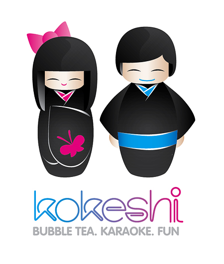
NOW BEFORE you jump up and say something like: "HEY! YOU! Why aren't they holding bubble tea?!" I'm going to quench your answer thirst, or quelch any questions, by pre-replying: "These guys are icons for the website" and complex versions of the logo versions, so they will never be used as part of the logo, so they don't have to be doing or holding anything! ALSO; please raise your hand if you want to ask questions.
ALSO (mainly aimed at Mr. Typo-judgey) don't criticise me for the poorly formed letters, they're ROUGH concepts. You can however criticise the appropriateness of the letterforms, which if you choose to do, I completely agree with. They're not appropriate at all really. Something more suitable would VAG Rounded with negative tracking (maybe -200) and either all-caps or all-lowercase! Hooray! Don't forget maybe a thick keyline around the letters (maybe 2 or 3 if you're feeling nuts) and maybe a drop shadow too. Although I am making a 'subtle' statement about the crappiness of 'fun' design, it really is appropriate and probably what's needed. Oh, and tilted on an angle to make it 'casual'!!!!!
IESSO
PS. Nerd-talk was fun. Not entirely nerdy enough for my liking though.
PPS. THIS IS WHAT I MEANT: Kokeshi or Kokeshit!? Looks like a toilet paper brand.

No comments:
Post a Comment