TYPO: HOT OR NOT?
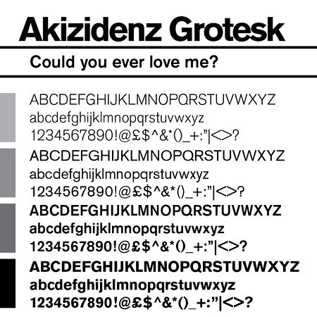
I SAY THE NAME SAYS IT ALL. Who here likes this typeface? Let's battle it out right here, right now.

I SAY THE NAME SAYS IT ALL. Who here likes this typeface? Let's battle it out right here, right now.
Posted by
Elliott Scott
at
2:11 AM
![]()

6 comments:
Well it is very nice.. i want it as my default font... HA I SAID IT... FONT... IN YOUR FACE
Anyway.... in my quest for very clean and modern looking fonts it rates high on my list!
T-ass
No but that's just it! It's neither modern nor clean! If you look in detail at the way it's drawn you can see it's very messy. It is over 100 years old, and one of the first sans-serifs, which gives it plenty of reason for being kinda crude, but there are so many nicer, cleaner and more modern fonts.
PS. font, typeface; whatever.
Linus, I unfortunately, and despite my whole point, agree with you. But in order to prove that it does fit in category 3 and not 2, show me an example. A recent example!
mmm see i like it and have to agree with linus.
I think the type looks good as a heading or a typographic element rather than a paragraph text block.
mmm we are nerds you realise.
anna
Don't 'BAM!' me just yet... so what if it's the corporate typeface of Western Digital!? It's also the face for ESB (the electrcity company in Ireland), don't mean it's good!
I've had to set an annual report in it, as well as a bloody powerpoint presentation! It's a hideous monster! It's only appropriate when you're trying to be 'retro' with your designs. Nothing new and modern (like a technology company) should use it.
Look chief, its gorgeous.
Its helvetica's daddy.
The numeral '2' in the light version is possibly the best two I've ever seen.
I won't bam cos it's all subjective, but its a lovely quirky typeface thats much friendlier and more choc full of character that the afore mentioned helvetica so there.
Oh and for Akzidenz nicities check out the 'Typography' book by Ambrose/Harris.
Oh and don't make me come over there!
Post a Comment