PORTFOLIOSAURUS
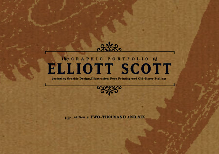
I'VE GOT THE THEME. NEW VERSION OF LAST ONE, BUT OLDER LOOKING. IT'S GOT QUAINT VICTORIAN CHARM, MODERN HUMOUR AND DESIGN THAT'S POPULAR NOW. So the theory goes anyway.
IESSO

I'VE GOT THE THEME. NEW VERSION OF LAST ONE, BUT OLDER LOOKING. IT'S GOT QUAINT VICTORIAN CHARM, MODERN HUMOUR AND DESIGN THAT'S POPULAR NOW. So the theory goes anyway.
IESSO
Posted by
Elliott Scott
at
1:51 AM
![]()

3 comments:
Wow...you have diverged a lot from your previous work. I just wonder though, how are you going to incorporate your brightly coloured work with this new all timey theme?...It's a bit of a juxtaposition [i've always wanted to use that word]. I guess i'l have to wait and see.
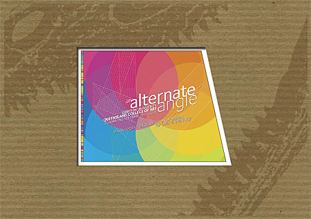
HA! good use of juxtaposition! We us it all the time so it's not so exciting, but I can see the appeal. Anyway, because the background is so dull and subdued the work will POP out more. It'll work. i think. I hope...
Linus, you are a bastard for these reasons:
- you're always right about design, and once again, you're right. I moved the Contents to a left-aligned, ragged-right and its better, as well as fixed the tracking. Nice work there.
- Your blog is better than mine could ever be.
- Your mom is hot.
Post a Comment