TIME COMMA RUNNING OUT OF...

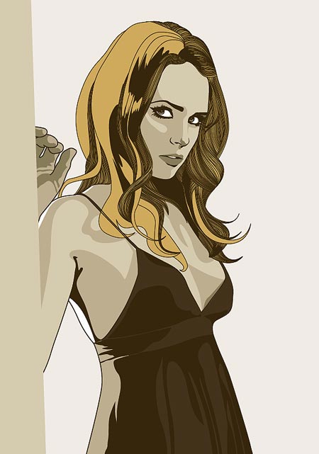
HERE IS ANOTHER ILLUSTRATION. This one is the most complex and has taken about 6 hours now. But the more I look at it the less I am inclined to use it. It's too sexual. The original photo wasn't so sexy, the girl was more mysterioud looking, and less 'come hither'. She was leaning against a pole outside some dodgy diner, but it looks like she's in silky underwears standing at her bedroom door. So what I need is some suggestions on how to change it. Make it more mysterious.
ALSO: I was watching an episode of the Simpsons and Steven Hawkings was in it. The end credits said he played himself. Now I don't want to sound rude but wouldnt the be able to use ANY computer generated voice, and not bother him?
ALSO: Tanner and Linus are organising a 'suprise' going away party for me and UNG. It's gonna be on the same night as graduation (it's our last weekend in Aust.) so contact them if you want more info. Linus: 'linus AT elbodesign DOT com' or Tanner: 'b_klever AT msn DOT com'
IESSO
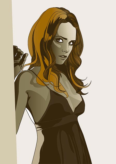
IS THIS BETTER? I like the look better, more mysterious, but its not as similar to the other images. They dont have gradients. Or as many colors. Yay? Or nay?


1 comment:
Awkward huh? How so?
Post a Comment