Wednesday, October 12, 2005

SELF-OBSESSED? WHO... ME?!

mondayne-fashion

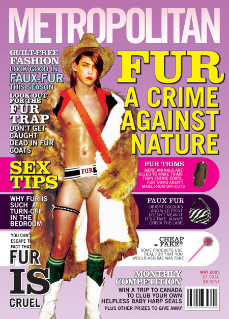
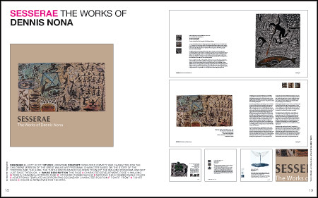
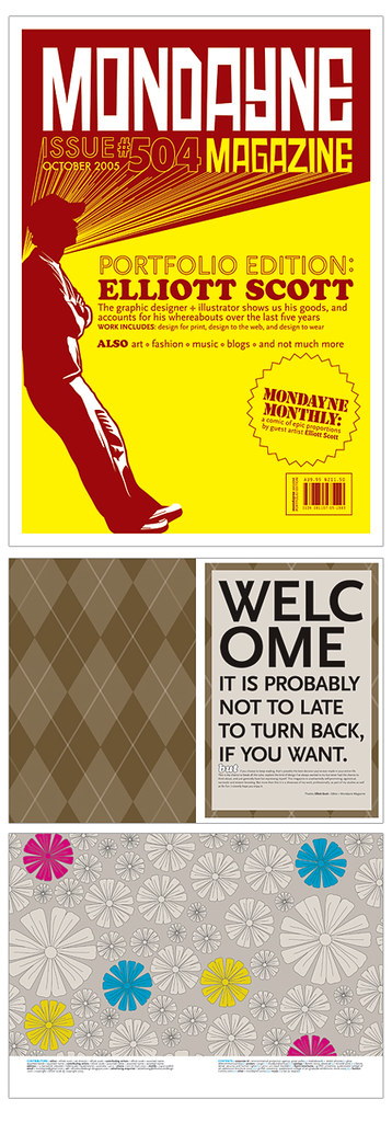
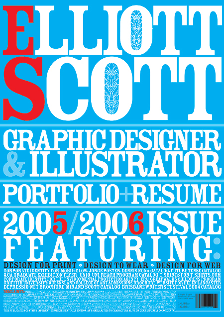
I'm doing a little mini-magazine to go inside the portfoliogazine dedicated to just the t-shirts I did. I'm only doing this for design accuracy and not because I'm fully self-absorbed or anything like that. Yeah right. Anyway the mini-mag looks cool enough I guess. Here is the cover. Nice and mundane. I'm not even wearing on of the shirts. HA HA! Continuity!? What the heck is that?

IESSO

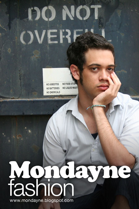
PS. Sittin' in front of a bin next to Liveworm. Great coincidence about the "do not overfill" message being right next to my brain. Good stuff.

PPS. It's little Mondayne's FIRST BIRTHDAY tomorrow. He's turning 1 year(s) old. Hooray! I can't believe I made it this far. I couldn't have / wouldn't have bothered if it wasn't for all you guys and your support. Thank you so much for the encouraggement and the readership. To celebrate I have a 20GB iPod to give away to anyone who answers the following question correctly. How many times have I changed the appearance of the blog (not including profile changes, just stuff like the background, or the masthead or stuff like that) Send me your name and contact details and I will choose a winner at random. Good luck. ***A clue: It's more than once, less than a billion times. Hope that helped.

Tuesday, October 11, 2005

SO VERY PREDICTABLE

fur-poster

I was gonna write a post about not taking my meds and it making me crazy (head hurts, dizzy, etc as well as the standard relapse into depression) I'm listening to my iPod now and the playlist is a bunch of songs my ex girlfriend used to play... blah blah blah boo hoo. Anyway I was working on some images that I'm putting into the folio. I spent about 4 hours on the image above, fixing things up, makingg sure colors work all goodly and all that. And when I finished I posted it on the web. BUT instead of saving a different version I (being the complete dumbass that I am) saved over the top! now the image is only 450 pixels wide instead of the needed 2500!!!! AAAAAAAahhhhhhhhh. That is so annoying it hurts my already hurting mind.

I give up. Time to watch TV.

IESSO

Monday, October 10, 2005

A LITTLE BIT SUSS??

WRITING THE COPY FOR THE END OF YEAR CATALOGUE. ONE OF THE GIRLS WROTE THIS. WE (THE GUYS STAYING LATE) LAUGHED OUR FRIGGGIN OVER TIRED ASSES OFF. I DONT THINK SHE MEANS FOR IT TO BE SUSS, OR RATE SO HIGH ON THE LAME-O-METER, BUT IT DOES. ENJOY.


Basic arty cakes

125g butter for flexibility ^
1/2 cup castor sugar for sweetness ^
1 tspn vanilla for that something extra ******^^^^^^^^!!!!!
2 eggs for pulling together ***^^^^
1/2 cup milk for consistency
1 1/2 cups SR flour for growth
1/2 cup custard powder for design secrets ^^^^^^^^^^


Exciting cake variations

Iced - Finished with a cherry on top
Snowballs - Looks a bit spiky but there's cream inside **
Chocolate - Always provides a satisfying finish ****
Sultana - Exciting pieces throughout
Coffee - Keeps working all night *************
Butterfly - Cakes Don't let them fly away ^^

IT WOULD BE SO MUCH BETTER IF THE 'EXPLANATIONS' WEREN'T INCLUDED. BUT NO, SOME PEOPLE JUST DON'T GET IT DO THEY?

* SUSS-NESS
^ LAMITUDE

SPREAD YOUR WINGS AND FLY AWAY?

PortfolioMagCS89

PortfolioMagCS2425

PortfolioMagCS2829

PortfolioMagCS1819

Oh the was bad. Really bad. Even for my standards. Anyway sorry about the lack of posts in recent days. AND doubly sorry for not even posting anything interesting. Only the damn portfolio spreads. Oh well, I have been kinda busy. Stressed to the MAX! I bought a $950 printer today. It is the top o' the line printer. 8 ink cartidges. Green and red ink! HUZZAH!

Well I'm gonna be busy for the next few weeks too.. so don't feak out if I don't update so often. I'm not dead lying in a ditch. There's no ditches near my house! I will of course we a zombie, walking around dead.

IESSO

Saturday, October 08, 2005

AWW TO HELL WITH IT!

covers

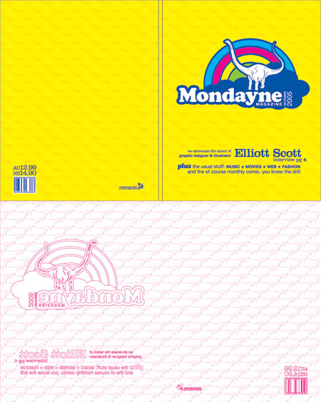
Everyone says that the cover is most important, what with the judging the book by it and all... so you can understand why I am so nervous about designing the cover, and making sure it is me, and at the same time good. Here is what I've come up with. It seems to be the least crap one I've done so far. So that's a good thing. Plus it's got a dinosaur on it. The only problem is that it doesn't match the style on the inside, but I'm not so sure that really matters. If I do some more hipster images I can get away with having plain text layouts. Or at least I'll keep telling myself that.

IESSO

NOTHING LIKE SLANDER TO GET THE BLOOD FLOWING

Cooper

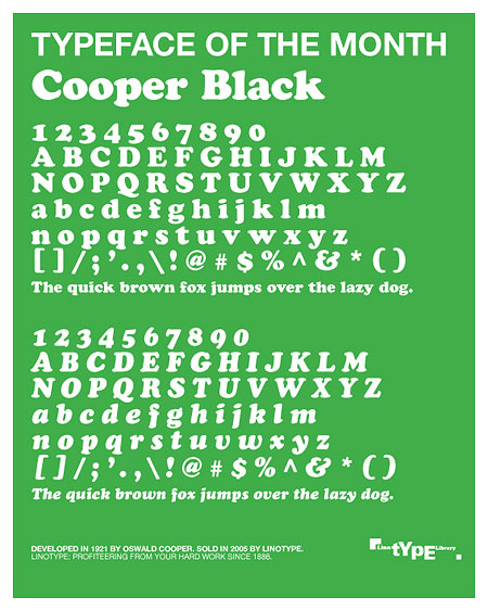
Another fake ad. for the mag. I guess it's not really that funny or anything. But it is a 'clever' way to incorporate my favourite font into the design, since I've decided not to use it for the layout.The caption down the bottom is the only mildly humourous bit. Mildly.

IESSO

Friday, October 07, 2005

BREAKING ALL THE RULES; a lesson in mundanity

Breaking-the-rules

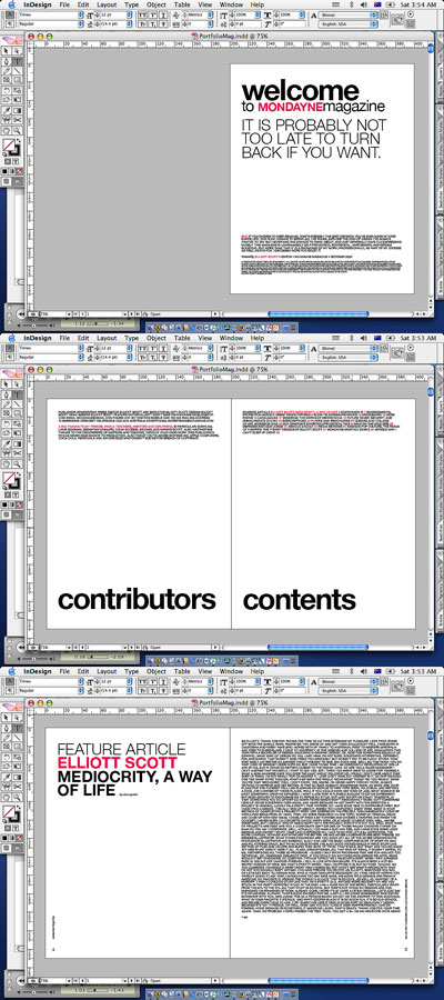
I'm working on the portfolio. Made it less pointlessly hip, and more mundane... but intentionally so. I've also thrown out the whole concept of columns. I never liked those guys anyway... If you read the interview (which you can't at this small size) it's pretty goofy. Instead of the traditional column/image type dealie, I'm gonna use a bigg block of text, with the answer/questions defined by bold/medium weights. Oh the insanity!

I might include a transcript of anyone is interested.

IESSO

PS. I apologise for the lacklaustre screenshots tonight, couldn't be stuffed doingg it all proper like in photoshop and all. Besides you get to have a glimpse at the real excitment that is graphic design. Huzzah!

Thursday, October 06, 2005

I HEART COPYRIGHT INFRINGEMENT

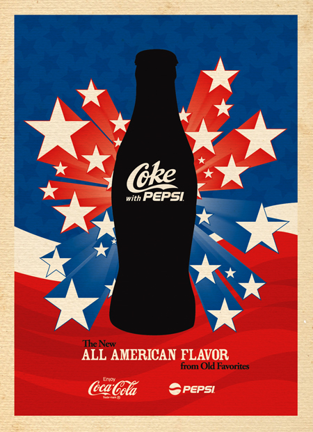
Pepsi Coke

I can't sleep (despite the fact I only got 4 hours sleep the last night and I was dead tired all day. I think I'm stressed or something) Anyway to try to remedy my little sleep problem I did a little fake ad for the magazineportfolio. It turned out a lot more complex (20,000+ elements!) and took a lot longer (2.5hours) than I expected at the start. But overall I'm quite please with the results. It's silly, but not too silly, not insulting, but completely impossible and it looks cool [in my opinion]

More fake ads to come, plus fake CD's and fake movies.

I'm fake Elliott Scott, signing off

Wednesday, October 05, 2005

SLOWLY, BUT DOUBTFULLY

Portfoliogazinelliott1
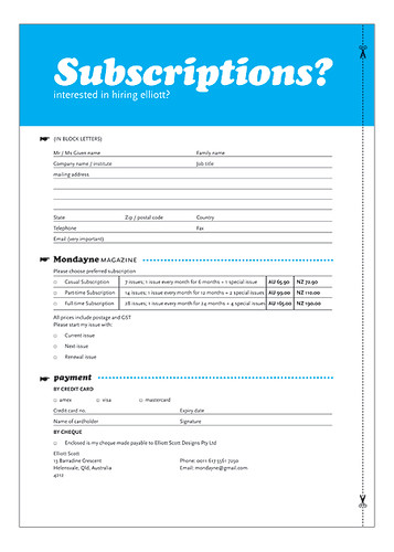
subscriptions

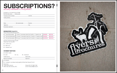
I was really excited about my catalog/magazine/portfolio/printed blog, but now I'm starting to get scared. Its looking shitty, boring and not very well done.

Fishing for compliments? Perhaps, but I do genuinely feel aprehensive.

Also, was supposed to be finishing at Liveworm monday, then tuesday, now it looks like I won't finish till end of next week. Getting pissed off.

IESSO

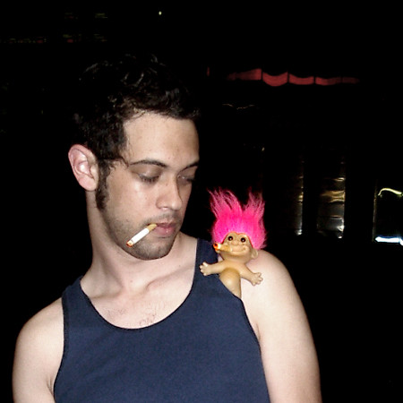
Bad-Influence

PS. Went outside for a smoke. A little devil appeared on my shoulder. Such a bad influence these trolls.

Sunday, October 02, 2005

I BENT MY WOOKIE

We were watching that show: "Australia's Brainiest Kids", which is like a quiz show for children. Some of the kids just lost the latest round;
HOST: Oh well, congradulations on being in the top percent of Australia.
ME: Hmm, isn't everything in the top percent? Without specifying the number? Isn't that the whole idea of percentage?
ME (to Adam): You're in the top percent of my friends...
ADAM: I hate to tell you this but you're in the bottom percent of my friends.

IESSO

WHEN CHEESEBURGERS ATTACK

McHeartAttack

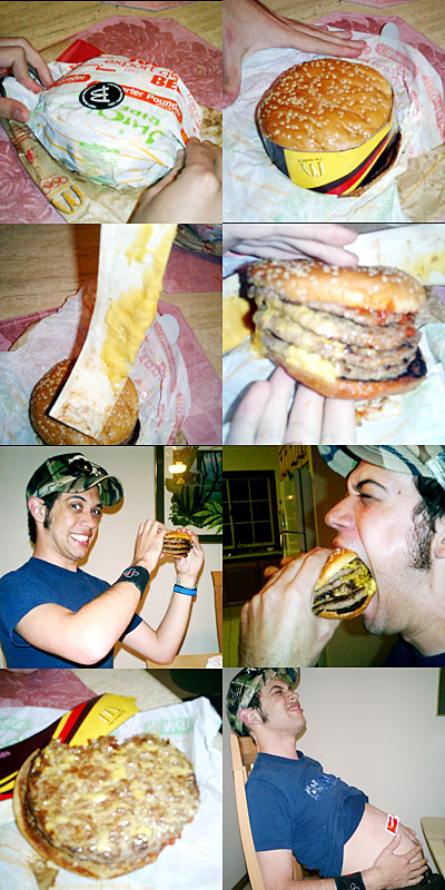
We finally managed to order a POUNDER from McDonalds. NO! Not a quarter pounder, oh no! a full pounder. 5 peices of cheese, 4 pieces of meat, 3 heat attacks and a double bypass. It was awesome.

FIRST BITE: Hmm, this is not so bad, it's actually kind of good.
LAST BITE: I want to die.

DISCLAIMER: Kids, don't try this at home. It has taken years of mental training to build up the stamina and resistant bacteria needed to digest the massive 96grams of fat included in the burger. This burger is literally not for the faint hearted. Its been three hours now since I ate and my heart is racing, I'm sweating and I generally feel horrible. But it had to be done. Whats next? The four-pounder!

IESSO

Saturday, October 01, 2005

THE BEGINNING OF THE END

TITLE-PAGE2

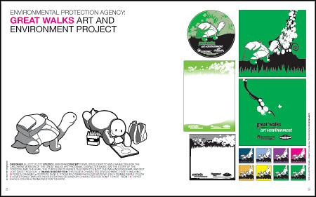
Well it's official now, we're graduating next month. In order to actually finish we've got to make this thing called a portfolio? So like, what ever that is? Anyway I think mine is gonna be a bit hip and funky, but not entirely stupid either. What I want it to say about me is: I am fun and funky, with a creative silly imagination, but who can do professional work in a tight timeframe and with an accurate eye. How I'm gonna actually say this is through a magazine style portfolio. I can have some of the work I did as advertisement style pages, some as 'articles' and some in a 'fashion' section. It will all be very tongue in cheek.

I've been thinking a lot about this: I don't want a job that is dry and boring and highly professional, I want a fun, funny, and funky job where I can be creative and develop my creative potential. Or something like that, so if I hand in a standard boring black folder it will suck, a fresh funky, egocentric magazine will surely do the trick,.... shirley?

Ok, so these next few weeks are gonna be intense! I have a F*CKLOAD of stuff to do, this magazine makes it so much harder than it needs to be, but it will hopefully be worth it.

IESSO

PS, I think I must have said funky about a zillion times in that post. Someone gimme a thesaurus quick!

FLOWERS

PPS. This is what the pages dividing the sections will look like. Well, this and other things like it. Not all flowers. This is only one of MANY spreads.

Thursday, September 29, 2005

IN THE NAVY


ivi092_editedResized
Originally uploaded by Elliott Scott.
Here is a photo of Tanner at work. You gotta admire his enthusiasm.

Tuesday, September 27, 2005

YES MEN

Comicatalog

I need your opinion on something VERY important. We've got to put something in the graduate catalog and I had submittted the sample included a few posts ago (The Catalog/Catalogue), but seeing everyone elses mine looks kind dull and mundane [no, not mondayne, for that would have been awesome of course!] So I redesigned some of it and came up with this. What do you guys think? Ignore the images of course, they'll be the same as before, these were the only versions I had on my laptop and not the work computer. Anyway do you like the comic style? Is it too cluttered? I guess it's hard to tell without looking at the other peoples images on the same page as me. There is one that is TOTALLY eye-catching, it pisses me off. Well not really, more like worried and insecure.

Anyway if you could give me an opinion in either the form of yes or no, or some sort of easy to do adjustment that'd be great. Come on guys at uni, help me out! I know we're competing, but your work is surely better than mine anyway, give a guy a break. I'd also like to hear from the non-designer type people like Tanner, Elliott 2, Angry (if you're still out there), Benji, Louise, Sars and anyone else out there who reads this at least once in a while. Your opinions really mean a lot to me!

IESSO

PS. A special request for opinion goes out to my spiritual guide and design hero; Dermo, if you're reading this, please gimme some feedback!

Comicatalog2

Well, because the feedback has been overwhelmingly negative aggainst the textured background I got rid of it. And it looks better. Thanks guys. Whoever said you were all a bunch of idiots was dead wrong. I changed the images in the boxes too to give a better indication of the final version. THANKS AGAIN!

your page2

Here's what it looks like in the spread. See why I was so worried? Your eyes are totally drawn to the girl on the yellow BG first! Oh the stress! The competition! Anyone who thinks design is easy is obviously not aware of all the in-fighting, competition and personal struggles. Sure we don't really have tests, and you don't have to be particularly smart, but there is a lot to think about, and you do need to be good with numbers and really exact with measurements. And pretty colors, of course.

Comicatalog3

Linus, you're right. Once again. This is better huh?

Dermo: I don't want you to think that I'm disregardingg your comment about putting in only the sprocket head, but it seems like EVERYONE is putting in snazzy vector graphics. I wanted somethign to distinguish myself from everyone else, despite doing nothing but vector graphics myself; hence the comic theme.

*** Ooops, just noticed the error caused by decreasing the line thickness in the purple box. I've fixed it up, but didn't bother updating the image. Problem solvered.

Monday, September 26, 2005

THE TIME HAS COME, THE WALRUS SAID, TO TALK OF MANY THING, OF SHOES AND SHIPS AND SEALING WAX - OF CABBAGES AND KINGS

Alice in Wonderland is a great story. One of my all-time favourites, but thats beside the point. My laptop has decided to sh*t itself. I think it's that time of year, a lot of people's having been doing this recently, both Mac and PC. Already on my list of problems was the harddrive not working at 100% so it runs nice and slow, but also the power connection is dodgy so I get shocked a lot AND most recently the wireless receiver doesn't work, so I can't use the internet at my house without major dramas. Any one of those things I can live with, two even, but not all three! I'm gonna back everything up (that's if my DVD burner which needed to be replaced 3 times already decides to work!) and then I'm gonna wipe it all, take it into the shop and let them fix it!

Despite all this I am still pro-Mac. I think it's partly due to the customer service at my local store, but hey, it's all part of the package baby!

I'm hoping to upgrade the "it's not the size that matters" 12in laptop to the top of the line "hung like a mule" 17in laptop. I know, I know, I'm over-compensating, but so what? I've gone blind using what I've got... we're still talking about computers so stay focused... so I think it's about time for a bigger screen, faster processor, more RAM and a big boost to all the other acronym parts as well!

IESSO

PS. I was dead tired today, and feeling woozy, but now I'm freakishly awake and it's pissing me off.
PPS. My phone ALSO died today. The buttons don't work (I think I wrote this in the post below) so I had to dig up an old backup phone. Which I think was from 1998? It's huge! Green and black screen, no phonic, so hard to use! Menu systems? what the hell is that?!

CRAZY-LONG, CRAZY POST DAY

Walk-on-the-Wild-Side_1big

Walk-on-the-Wild-Side_1smal

FRONT/OUTSIDE

Walk-on-the-Wild-Side_2big

Walk-on-the-Wild-Side_2smal

BACK/INSIDE

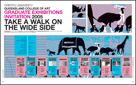
Here is the QCA Exhibition invite flyer I'm working on. They friggin better use it, I've spent ages on it and my computer kept crashing because the file was so complex and I have been stressing out to the max, so they had better use it if they know what good for them!

I was asked why I choose to use a high-heel shoe instead of something more blokey like an army boot? Well, I don't know. Maybe its cuz thats insane! No, I don't know. I'm not a bloke I guess (although I don't wear high heels either) but yeah, army boots are too angry and intense, and not as strange for a giraffe to be wearing.

A quick note about colors: The pink is supposed to be an intense flourescent red/orange, but for some reason the screen can't reproduce those colors well (don't ask me why) so it looks like this. Think intense mind-melting, eye-bleeding colors and you'll understand what it's supposed to be. Freakin awesome!

ALSO had a crazy day today, didn't sleep much last night and was tired and fell asleep under my desk at work, and at the back as well. And I'm supposed to get paid for the logo I did but haven't so far and they had better not be trying to rip me off or I will kill them. Kill them all!

And my phone is broken so I can't type SMS's, which is stupid and annoying and I can't dial any numbers with 6 in it! So that too is crazy and annoying.

So this post makes no sense but I really am not in the mood to fix it. Kind of cross between really tired, preoccopied with thoughts about uni, work, money and the unamed girl. CRAZY! as well as getting sick. HOORAY!

Anyway I think these images will work in your browser, but if they dont let me know I'm I'll fix them up.

IESSO

Friday, September 23, 2005

OLD SCHOOL

I've got an assignment to come up with a logotype for a recruitment agency in the media industry. Aside from the actual logo (which isn't my personal favourite) the clients did something totally awesome, they wanted some changes, bit and peices from each of the concepts, and in the email they said they cut and pasted around, but I didn't think they meant this:

media-board-new-concept-003

Also, there is this mysterious gas station near Harbor Town. It's really strange, no-one is ever there, there isn't a place to pay, only an ATM and it's always surrounded by blackness. I think of it as an island of light, in a sea of blackness... um.. well I do!

Island-of-blackness

I concede that this image MAY have been photoshopped a little bit. But only to enhance the island of light-titude of the image.

I'm Elliott Scott, who may have been enhanced in photoshop, signing off.

Thursday, September 22, 2005

YOU JUST DON'T GET IT, DO YOU?

On the train there are two kids playing 'Eye Spy', one of them doesn't quite grasp the concept.

Harrison: I spy with my little... something beginning with big.
Jordan: No, you have to say "I spy with my little EYE"
Harrison: I spy with my little something beginning with green!
Jordan: {sigh}... that book over there?
Harrison: No...
Jordan: Umm... Mum?
Harrison: No...
{5-10 minutes pass of Jordan guessing incorrectly over and over again}
Jordan: Is it that house?
Harrison: Um, yes.
Jordan: But you didn't see that house when we started playing.
Harrison: I spy with my little...

Poor little Harrison, he's not so bright.

ALSO

Check out the bestest and greatest website EVER! It's a bit slow, so if you're still stuck in 1995 (dial-up) you might have to give it a miss, or not appreciate it's full awesomenitude. Click HERE! My favourites are the Designer Republic and the Rex & Tannat McKay bottles

Here's an enticing screenshot! It rules, but the individual bottles kick some major design ass. Vector art at its best.

iCoke

IESSO

Wednesday, September 21, 2005

THE CATALOG / CATALOGUE

Elliott-Catalogue

So we get a massive 125x105mm to showcase ourselves in this years graduate catalog. I seriously doubt my self and the crappy work I do, but was forced to put something in, and this is what I've come up with. I dunno. My friends say it's good, but I don't think so. The problems I have with it, aside from the dismal work quality is that it's too narrow a scope of my skill set, I"m not just an illustrator, although I certainly do enjoy that stuff best, but I also can do layout work and ... um... typography? Well maybe not, but I don't like putting myself into a category.

Poser

I do like this photo of me! It's also going in the catalog as my profile shot. Although without the blueness or the swirls, but it's till cool. You will like it too. On the count of three you will do exactly as I say.... 1....2....3.....

IESSO

Tuesday, September 20, 2005

3 PART POST

REENFORCING STEREOTYPES

Two people got off the train in front of me, one was a business man; suit, tie, briefcase, etc, the other was a rough-type with peircings, a shabby beard and smelled of rum. The business man accidentally bumped into the rough guy. Without missing a beat or saying a word he beat the business man up. He beat the living crap out of him, punching him over and over in the face and when the guy fell down he kicked him in the stomach. I was stunned. I wanted to help but I couldn't, I'm not strong and this guy would have beaten the shit out of me too. He kept yelling "Have respect for other people!" over and over as he was unrelentlessly hitting the business man.

And to make matters worse the security gaurds didn't do anything except stand on the train and watch. It was not a good scene.

I'm still quite shocked about the whole thing, not really beleiving it happened. That kind of thing doesn't happen in Helensvale. It shouldn't even happen anywhere, the business man slightly bumped the rough guy, and he didn't even get a chance to apologise. It's not like he pushed him out of the way and didn't say anything. I dunno.

KUNG-FU HUSTLE

Speaking of random acts of violence...
Linus had some friend around last night for a Kung-Fu marathon. It was fun, you totally missed out. We ate Mexican food and watched Kung-Fu movies. Some were good, some were not. We then watched Harvey Birdman cartoons, which were hilarious!

OTHER LESS VIOLENT AND MORE SILLY THINGS:

1. Why are 'ladies of the night' and 'creatures of the night' so very different?

2. If talent scouts find talented people of various feilds (ie, sports) why don't boy scouts or girl scouts search for little boys and girls?

3. Next time someone says that you can't see air, point at the sky. The blueness is caused because the air reflects the gamut of color from white light sans the blue wavelength. And the reason it looks like a shell is because we're looking at air. But I guess you sort of already knew that one. Point is: you can totally see the air.

IESSO

PS. The performance-blog that I mentioned earlier is now up and running: Error404:Mondayne. There is only one post up there at the moment, but you can check it out once in a while and get a disturbing insight into my sad and pathetic life. HA HA! Melancoly!
The address is www.error404-mondayne.blogspot.com