AWW TO HELL WITH IT!

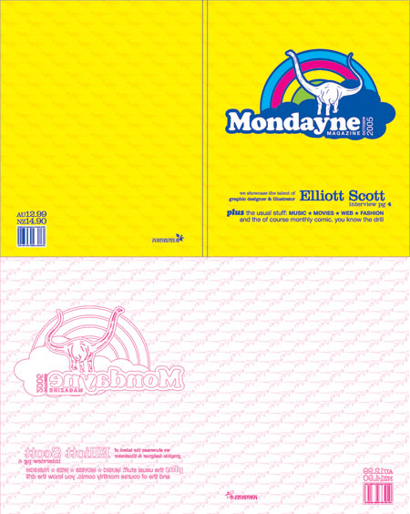
Everyone says that the cover is most important, what with the judging the book by it and all... so you can understand why I am so nervous about designing the cover, and making sure it is me, and at the same time good. Here is what I've come up with. It seems to be the least crap one I've done so far. So that's a good thing. Plus it's got a dinosaur on it. The only problem is that it doesn't match the style on the inside, but I'm not so sure that really matters. If I do some more hipster images I can get away with having plain text layouts. Or at least I'll keep telling myself that.
IESSO


1 comment:
that makes no sense. so you can stay
Post a Comment