BREAKING ALL THE RULES; a lesson in mundanity

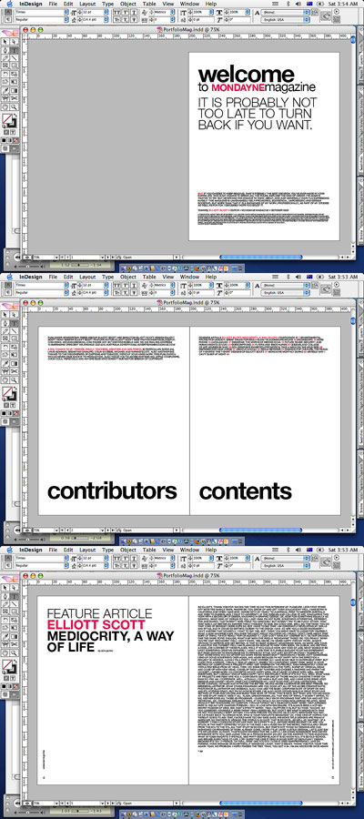
I'm working on the portfolio. Made it less pointlessly hip, and more mundane... but intentionally so. I've also thrown out the whole concept of columns. I never liked those guys anyway... If you read the interview (which you can't at this small size) it's pretty goofy. Instead of the traditional column/image type dealie, I'm gonna use a bigg block of text, with the answer/questions defined by bold/medium weights. Oh the insanity!
I might include a transcript of anyone is interested.
IESSO
PS. I apologise for the lacklaustre screenshots tonight, couldn't be stuffed doingg it all proper like in photoshop and all. Besides you get to have a glimpse at the real excitment that is graphic design. Huzzah!


No comments:
Post a Comment