
DONE! AND DONE!
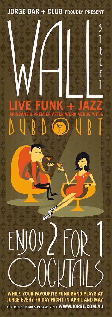
I REALLY like this. And I never say that. This would have to be the first thing I've EVER done that I'm pleased with. I reckon it's groovy. I like the colors, the typefaces, the illustrations and the fact that I did it all from scratch. I used some fonts, but altered them heavily (ok, so I didn't alter Trade Gothic but whatever) And the illustrations were based on other styles but I drew them myself and added my own style to it. So basically this design is ME! It's everything I like. I (like always) add a picture of myself in the work, and the chick is some ideal girl of mine... I dunno. Anyway, I'm happy! I made some minor changes, mainly changing the chick from a 60's mod to a 00's hipster. Good change methinks.
IESSO

7 comments:
ADAM here
i am undecided between this one and the one below... the one below is simpler and that appeals to me more... however in both of them i have a font issue... in the one below the wall st seems too mondayne and photo-shopped on.. i dunno how else to describe it.. it doesnt seem to fit right... otherwise on this poster i dont like the word "cocktails"
thats my personal preferance, u know how i hate disorder and chaos. the C and O make me feel sick
Yeah... im gonna have to go ahead and not print that out for you... sorry its just too much ink and not my printer
Another person with an issue with the C and O! What's with you people and round things! Okay fine. Well I like it. BUT I appreciate your comments, especially yours Adam... honest and true. Which is good. Although I'm not sure what you mean by Mondayne. Or photoshopped. Modayne referring to the messiness? And photoshopped because it's just stuck over the top of the other stuff....??
Hmmm.. I dunno how to improve it to more your likings without changing the whole integrity of the image. But something to think about anyway...
Now I'm paranoid.
Yeah, actually I see what you're saying about the C and O. They are pretty big. But too bad! I like it!
No but seriously, there is a reason for that...
1. They used to do that kinda thing back in the Art Deco days, with the neons signs often have one big letter, and the rest squished.
2. Visual continuity. The circle element is repeated often... The buttons on the jackets, the olive/cherry in the drinks, the C and O.
3. I like it! It's yonic! WOOT!
Elliott
And it's no big deal with the printing. Thanks anyway. Maybe _someone else can print it for me on his fancy new color laser printer. Heh heh heh...?
Adam again
i like the phallic wall street much better it fits in.
As for the mondayne comment.. i mean it looked plain and boring and out of place of the rest of the poster.
And cuz im too lazy to post another comment cuz of my inferior internet speed.. i am gonna tell ya that i like the chick from column A .. the old skool shit! - but wit one little differerenceece.... make her hair a little darker-ish .. make it stand out just a lil bit more
Oi I like it aye! - think the new chick makes it fit in more with who actually goes to jorge and the feel of the place and the guy represents both old old skool and new skool so that works - the type is sooo much better than it was and i'm liking it so just print it out cause your finnished - i never really noticed the C as being annoying, it is rather large but i dont think its that much of a big deal cause it helps finnish the trail for where ur eye is lead - like an S down the page . . . print it already!
An interesting side note: In Dublin there is a gay-bar named Jorge. Not that I've been there... a 'friend' told me. And by friend I mean Gav. And by Gav I mean Gavin Roche. He never goes there, or so he claims! Thanks Gav for the info!
Post a Comment