
JORGE POSTER 1
Hey guys, here is a poster I've done for Jorge Bar + Club in 'bane. Could you please give me some feedback. Don't forget, I like my feedback candy coated, so if you have some criticism, please make it constructive, and not just: "It's crap!" THANKS! Here is what my opinion is:
WHAT I LIKE:
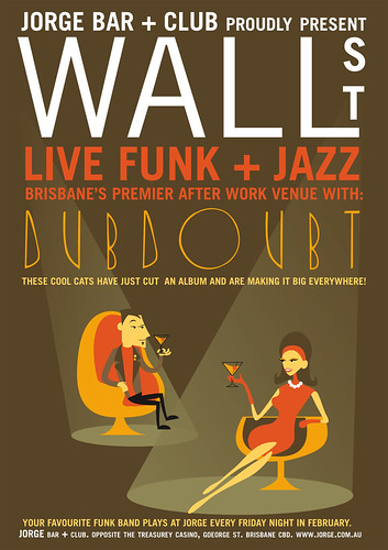
- The colors. They match the colors of the bar, and have a modern feel to them, but also a classic 'retro' style too. Well suited to jazz.
- The type. I think it works, but some of you may think otherwise.
- The illustrations, although these are only filler people,... I will replace them with jazz musicians in the very near future.
- The way that the spotlights reflect the shape of the cocktail glasses. Visual symetry rocks!
WHAT I'M UNSURE ABOUT:
- The arrangement of all the elements. Ok, so the people will change, and that'll probably change things, but still... It feels a bit top heavy.
- The colored text? I like it better than an all-white version, but maybe you've got some ideas.
- The important info. Now you must remember that this poster is for inside the bar itself, so advertising the bar doesnt have to be that important, but it still seems lacking.
Thats about it. You don't need to write that much, but some feedback would be good. Even in the form of YES and NO. I know people read this site, so there is no excuse!
Thanks again, IESSO
Ok, so below is a revised version. Linus recommended changing the typeface on 'Wall St' so something less conventional. I like the long'n'skinny format better than the standard as well.... I also added some extra details and more info allowed by the page size. Overall I'm quite pleased with it so far. Some changes still need to be made though. Elliott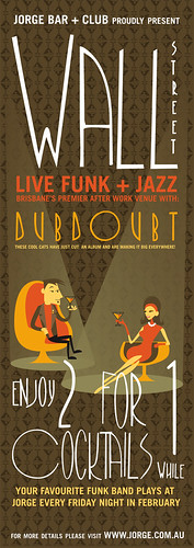

4 comments:
Hey cheezoid - so I think it is definetly an improvement and is cool/funky and stoof - likin the colour application and I really like the image, especially the guy - he is tres cool!
I'm think the the image needs more space - the overlapping of the 2-4-1 is kinda making it feel not as jazzy and mellow . . . maybe make it a little smaller or move it down a little or a bit of both.
The "your fav band plays . . " bit at the bottom I don't know . . I feel like it needs a closer relationship to 'dubdoubt' try
K this is what i reckon u can ignore it completely - try it if you want, if u hate it sorry i said anything - i see it working in my head if you take the 'your fave band bit and put that above 'doubdoubt'- then the cool cats under that and move the enjoy '2-4-1' bit down to give the image more presents. - but overall i reckon its cool as i'm really liking the wallpaper look in the background!
K there you go boyo! See you next month mulletino!
k so i tried what i said in photoshop with ur thing and im not so sure now
k i take it all back - been mucking around with it and am destroying it as i go - so i think leave it its all good but i will mention 3 things maybe wanna tweek a bit
1 - text under dubdoubt
2 - 2-4-1
3 - your favourite ......
what u do with it? - man i'm a retard - you all prob knew that anyways k boi
Yeah, I've gotten some good back feeding from you (Elvira) and Linus in person, and from everyone in class. Overall I guess we agree that the concept is working, it just needs some tweakin. I'll be doing that tomorrow, and the production of the second poster in the series... so that'll be cool!
Post a Comment