WARNING: PROBABLY OFFENSIVE (updated)

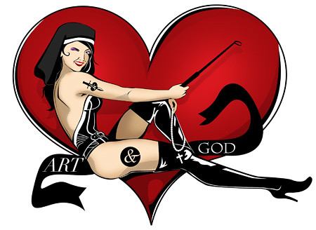
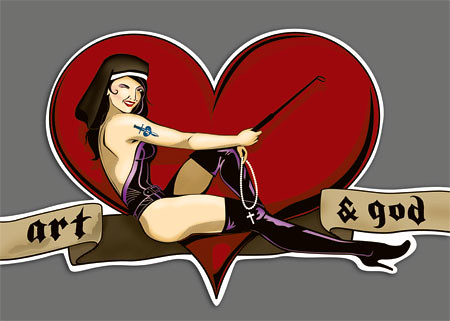
I'VE GOT THE CRAZIEST ASSIGNMENT EVER. The clients are doing a series of controversial lectures (isn't everything controversial these days?!) about God and religion in art, the pro's and con's and the for and against and I'm supposed to do the posters for them. This involves drawing this image here, and making it look like a decal found on a skateboard. THEN I have to buy a skateboard and 'age' it by throwing it around, grinding it and generally scuffing it up, and putting the decal on it, as well as all the text.
At this stage the image is VERY rough, crudely drawn, poorly rendered and featuring a busted up face, but I'll update you on the progress so you can get a better idea of how it's SUPPOSED to look.
NOW, I need to know, is this image particularly offensive? and how? Does the religious allignment offend you? Or the scantly clad girl imagery offend? The people at work are totally non-religious and have no problems with that side of it, but don't like women being seen as sex-objects. As a form of justification (bullsh*t) I might point out two things: 1. The client who this is for is a woman, and 2. She's actually a dominatrix, therefore being sexually in charge, rather than a submissive sex-toy role.
But still, let me know your opinions. AND let me know how to fix her face. It's totally screwed up at the mo'.
IESSO
Finally done. I can stop annoying people all around the world now. Sorry everyone!


8 comments:
Just to clarify - it sounds from your description of what the client is after that it's supposed to be offensive to 'traditional' religious sensibility, though. So are you asking because that's what you're going for, or because that's not what you're going for and you don't want anyone to bomb your house?
P.S. - in my opinion, there's a big difference between God in art and religion in art. God in art is about inspiration; religion in art is about subject, form and convention. Not that that is necessarily relevant to your project.
Interesting set of lectures, though. Where/when are they being delivered? Private or public?
Yes, ok, I am a bit of an idiot. The client wants controversy, not to be offensive. But she also wants this kind of imagery. So I'm not sure what to do.
Yes, I want to make the client happy, but no I don't want to be bombed. I cant object to doing the work on moral grounds because it doesnt offend me in any way, but I can see how it might do to others.
Sarah: The lecture series DOES sound interesting. I'm not sure exactly when or where, but I am doing the posters for the lectures, so I'll know next week. Check back then.
Linus: Emabssy you say? Mohammed, hmmm.... sounds fun. I'm up for the challenge. But my question is this: If there are no images of mohammed, how does anyone know what he looks like? AND why would people be offended seeing his image if they can't be certain that it is him? I'm going to draw a picture of a guy and SAY it's M, are people gonna kick up a stink?
I have a question to pose: is this image as equally controversial as the artworks from the lecture series? I just think it should accurately reflect what its advertising. I'm not overly religious but the image did offend me slightly - mostly the nun reference. I like the subtlety of the rosary beads though. Call me picky but (just a tip) you could make them look more like rosary beads too - unless its just a cross and chain of course :) As for the illustration... It looks great!
ANONYMOUS: Not sure how controversial the artwork being discussed is. I am but a humble illustrator/designer, its a need-to-know basis. I imagine they would be, the speakers they're getting are some pretty big cheese who do some crazy stuff. They're flying them in from around the country and putting them up in hotels and everything, so its not small time stuff. So it'd have to be at least a little controversial.
Besides, what the client wants, the client gets.
Also: They are totally meant to be rosary beads. Good eye!
LINUS: Will switch the eyes around. I couldnt figure out which way was best. I thought the eye closest to the 'camera' was the one that winks. But what do I know?
I got UNG to pose for me and it seemed to make most sense this way. But will experiment a bit.
And no, she wasn't wearing this costume, she was fully dressed.
LINUS: That M*****d emiticon is offensive. I would delete it but I'm not sure I can tell where his mouth is. It that . a belly button? BUT ITS STILL DEEPLY OFFENSIVE! shame on you!
oh wait, i think i get it. He's sitting down cross legged, and wearing a fruit hat like Carmen Miranda. Right?
hehehe yeah. stupid whatever you said...
Post a Comment