Monday, July 25, 2005

ABOUT THAT AND A BIT LESS

Does anyone know what ever happened to Austin Powers? Why no talking about it except in muted tones? It wasn't that bad, it was good... right? And on related note: What was Dr Evil talking about when he said "About that and a bag of potato chips"? Some sort of pop reference I missed, and I pride myself on pop culture knwoledge. Pride!

So anyway: I have done absolutely nothing today. NOTHING! Didn't go to class, didn't go to Liveworm, didn't even get out of bed. Why: because I felt like it? I dunno, I just didn't. To make up for it I might work on that freelance stuff I gotta do. But maybe not... I'll keep you posted. Get it! Post!!!! Oh man, blog jokes, the new lowest form of humour.

iesso!

PS. Yeah, that probably was the original meaning and the phrase turned full circle.

Missing-Button

I like the idea of a sincere and tragic poster of a missing trivial object. Someone loves their stuff so much that anything they lose gets equal importance to say a dog or cat.

ALSO

I submitted the "Mix Tape" shirt to Threadless.com. I'm nearly certain I won't get selected for 2 reasons.
1. It's not in the same sorta style as the 'look-at-me-I'm-trying-to-be-quirky illustration style that they seem to like. Which I for one don't like, I'm really sick of it. Actually this whole indie-scene thing with the embracing your nerdish ways seems to be getting annoying. And also...
2. It's crap.

But back to my rant: Yeah, I'm getting f*ing fed up with vector graphics these days. What the hell is wrong with everyone, can they not see that they're not being original. Quirky vector graphics are about as quirky as vanilla ice cream. Go to threadless and you'll see what I mean. They're cool I guess, but not as cool as they think they are. And I'm not saying anything I do is any better, it's just that there is something wrong with the vector graphics trend at the moment.

For some reason I'm really pissed off today. I think Linus's annoyed-ness has rubbed off on me, or something. He was pissed off at the uni system, and disillusioned with the design scene. I think I might be as well. At design, not the uni. The uni is too crap to be annoyed at. It's like being pissed off at a mentally retarded kid with no arms or legs because he doesn't play baseball very well.

Sunday, July 24, 2005

HAPPINESS IS A WARM GUN

The train was crowded this morning. Not catching the 7.30am train anymore. You know what's worse than a middle-aged mans crotch in your face for an hour? When his hands can't be accounted for. And to make matters worse there was a SEXY girl across from me, but I couldn't talk to her because there was a wall of crotches. Smelly crotches. "Just move!" you say, well I can tell you, that was not possible. No room whatsoever. HOORAY!

You know those trains in India that are REALLY crowded. Yeah. That.

IESSO

CLICHE

Mix-Tape

Go on, admit it, you made your sweetie a mix tape. You were all like: "I've got a great idea, I'll make her/him a tape of songs that say exactly how I feel about him/her. What a great idea, I sure am original. She'll/he'll love it!" But little did you know that it has been done before. Since the dawn of time. Well, since the invention of tape anyway.

I dunno. I guess I'm just a wee bit bitter about it all.

IESSO

A BIT TOO EXCITED

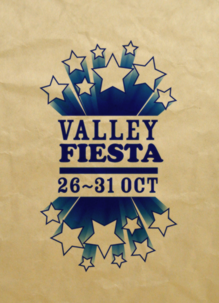
Valley-Fiesta-Concept

Okay so maybe I'm getting a bit ahead of myself, and I already have more than enough work to do but OH MAN! I am liking this Valley Fiesta breif. YAY! Now is my chance to do all the things I love; hipster images, use of my favourite typefaces (Cooper Blck, Rosewood Fill, etc etc) and all the rest!

Yeah, sure uni hasn't actually started yet, but seriously I couldn't help myself. This one is gonna be AWESOME!


It's a bit of a beginning of the end type thing. The first assignment of the last semester. This semester is gonna kick some ass! It won't be easy though, 5 classes, a part-time job (as the in-house designer for a swanky lighting company) AND Liveworm! Whoah. BUT at the end of it my portfolio will hopefully be good enough to get a job... in NEW YORK!

It's official kids, I will be leaving Brisbania, possibly for good... Off to greener pastures as they say. First it's Dublin to visit my good friend Dermo, and then to the Big Apple. (Apple!!! They have Mac's there [sorry]) Hopefully I'd ba able to convince Dermo to come along to NY. I don't really wanna go there alone, and plus it'd be cool. He might like it. good design there, might inspire him....


Ok, that's about it for tonight. I've had many cups o' coffee, and I'm feelin' fine.
IESSO

PS. Yes, okay maybe it is a little mediocre, but its a starting point, not a finished concept. Shut yer cakes holes until I'm done, THEN you can make fun of me untill yer little cold, blackened hearts are contempt.

~~~~~~~~~~~~~~~~~~~~~~~~~~~~~~~~~~~~~~~~~~~~~~~~~~~~~~~~~~~~~~~~~~~~~

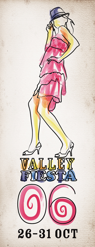
Okay, here's another concept I did tonight. I think I might use this theme of paper it seems to work for me... you may disagree. It brings things back to a real-world context (that is such a wanky thing to say I know) but it does! The Valley's got lots of flyers and shite and this draws inspiration from that. Also it works with an artist sorta theme too, in particular the image below, rather than above. I just 'bought' Corel Painter 9, and I'll try it out. The image below was done in Illustrator though, with finishing touches (ie the paper BG) done in Photoshop. I was playing around with all the different brushes in Illustrator. Did you know there was like this whole 'nother world besides the pen tool?! I did not. Anyway somewhat hip.

Lemme know what choo think. REMEMBER! Concepts, not final work.. don't be too rough. I'm sensitive. and wimpy.

Valley-Fiesta-Concept-2

~~~~~~~~~~~~~~~~~~~~~~~~~~~~~~~~~~~~~~~~~~~~~~~~~~~~~~~~~~~~~~~~~~~~~

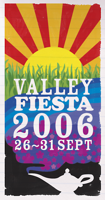
Yeah okay, this'll be the last design for the night. It's generic yes, but with some more detail, and some general good-er-ness??? it might be okay. Again, it's only a concept. I can't stress this enough people.

By the way, don't you just LOVE the stock-standard Elliott Filter TM? It rules, I know.

Valley-Fiesta-Concept-3

Alright there you go, 3 moderately different designs (well at least 2 anyway) At the very least can you tell me which of the three you like. Thanks.

Elliott

Saturday, July 23, 2005

THE RESULTS ARE IN, AND I'M AFRAID THE SITUATION DOESN'T LOOK GOOD...


Nerd
Originally uploaded by Elliott Scott.


You know how much I love and trust the reliabilty of random internet tests; well I took another one: A Nerd Test. I disapointingly scored 45%. Which I guess means I'm somewhat nerdy, but not entirely. As they called it: Lightly Nerdy.

Take the test if you want by clicking HERE and let me know what results you get. I'm particularly interested in Linus's results.

TWICE THE STUPIDITY, HALF THE FAT

I was walking down the street and I could hear a kid walking behind me making flying noises.... I turn around and he has a Batman toy. Batman can't fly. Like. duh.

Why is it always so weird to walk up stationary escalators?

I'm a puzzled Elliott Scott, signing off


PS. Hey guys and gals at 'worm, did you have any problems logging in to the computers on the weekend? I certainly did.

Friday, July 22, 2005

JOKE O' THE DAY

Three men are stranded on a desert island and have no food or water.
Suddenly a pack of cannibals jump out of the bushes and tie them up then take them to the cannibal king.
When the arrive they are untied and the cannibal king says, "If you want to live you must perform two tasks and the first is to go into the jungle and find 10 pieces of fruit then return."
The three men go into the jungle and an hour later the first guy comes back with 10 pears.
"Very good," said the cannibal king. "Your next task is to stick them all up your ass without showing any sign of emotion."
He sticks the first one up and screams so the cannibals jump on him and eat him.
An hour later another person comes back with 10 grapes and the cannibal king says the same thing.
He gets nine up and then bursts out in laughter so the cannibals jump on him and eat him.
The two first men are up in Heaven and the first guy says to the second guy, "Why did you start laughing?"
the second looks back at him and says, "I saw the third guy come back with 10 pineapples."

Southpark-Elliott


Still waiting on some more SP characters.
- Hyu
- Suminsen
- Angry, Louise, Benji, other readers
- Revised versions of the LW gang


CLICK THE IMAGE TO GO TO THE SITE

adamPark 1-1

Tanner

27881368_d988a927fb

RE: Linus

I think I forgot something...

Glen

Well someone had to do it, and it was Glen. Well done buddy. His caption reads "i think i might have forgot something...", I dunno what would be though?

Wednesday, July 20, 2005

PUTS THE REST OF US TO SHAME

Elvira

Elvira posted HER version of herself, and goddamn it, it's freakin perfect. Makes the rest of us look like amateur hacks. Which of course we are, but that's not the point.

Thanks Elvira, thanks a lot!

IT'S ALL UP TO YOU NOW

I (and Linus) heard a bizarre cover version of Coolio's Gangsta/er's Paradise yesterday while munching on pizza. It was a SALSA version. Very cool. BUT I don't know who did it. Lino suggested it was Senor Coconut, but turns out it wasn't. Does anyone know it was by. Or ever if it exists? I don't think i'm crazy, but maybe I am. Dermo, you're a self-proclaimed muso, I'm looking at you here.

Also: Benji, this is an invite to join in on the Southpark shenanigans. Also Louise, Angry, Glen and CheesyMulletino. Email your results, along with a photo if you want. It'd be nice to put a face to the names/alias's, even if they are cartoon ones at that. :)

MY BACK IS HUNGRY

boom-dis

Hey guys and gals can you please gimme some gentle feedback on this design I've been ordered to do by and for my mom. I know, that's kinda lame, but whatev. My mom is designing some boomerang dishes to sell to hotels to sell to the masses, and needs some promo junk made-up. Despite my suggestions of more things, all she wants is a single A4 page with the info. So that's what I did.

Okay, any suggestions or GENTLE criticism or a general sorta thumbs up type dealie. That'd be awesome! Thanks.

Elliott

PS> No-one say Ikea. I know, I know... I started doing it and I looked away for a second and BAM! Ikea. Oh well.
PPS> I like totally made that display font. It is awesome I know. I should entered it in the DIA comp. Totally would beaten Linus. TOTALLY. Its got a boomerang as an r !!!!

Tuesday, July 19, 2005

TOO MUCH PINK?

CrakHor

I wasn't aware of it, but apparently I am, and have been for quite some time; a crack whore. So that's that I guess.
Nothing to post that you'd be interested in...

IESSO

SO EMO IT HURTS

***image deleted cuz it was lame***

IESSO

Nope, nope waita second. Just when you thought I couldn't get any emo-er, I managed to out emo myself.

Even-More-Emo

Benji - If you're readin this, no criticisms ya here! Don't make me send you to time out.

Monday, July 18, 2005

COMPUTERS THESE DAYS... UPDATED!!! again...

SUTHPARK-Dermo2

Dermo found an awesome site where you can make your own Soutpark characters using the PPOWER OF FLASH!!! I couldn't find his site, being in Dutch and all, but I did find another one which works just as well.

Let's play some games. Guess who is who?

NOTE: The top one is Dermo. But the game starts here:

SUTHPARK-Me2
A


SUTHPARK-Austin
B


SUTHPARK-Indiana
C


SUTHPARK-Linus
D


SUTHPARK-YourMom
E


Did you manage to guess them all? Probably huh? Well just in case you didn't the answers are in the comments section. If you wanna try the game out for yourself that'd be cool, email your version of YOU and I'll post em up as well! Fun for the whole family. And who said Southpark was dead???!!!

IESSO

ADDITIONS (Done by me, where otherwise specified)

LinusSelfPort
Linus's Version of himself *Although word 'round the office is this is the way Linus WANTS to be, rather than is. What is with the fingerless gloves dude? You Lara Croft or somethin?

Sebastian
Sebastian (The boss at Liveworm!)

K
A person we all know, but who's name I won't mention. We love to hate her.

_______________________________________________________________

Here's the gang at the Worms versions. Some got a bit carried away.

maggie2
Maggie

Jen
Jen

Anton
Anton

lana
Lana

Scott
Scott

belinda
Belinda

ying
Ying

novi
Novi
___________________________________________________________________

SPLW

Liveworm-Gang

A - Jen
B - Maggie
C -
D - Lana
E - Scott
F - Novi
G - Some Jackass
H - Belinda
I - Suminsen
J - Ying
K - Anton

Saturday, July 16, 2005

CHRISTMAS IN JULY?

Slave The Whales

Yep, in the everloving niceities? that I am... uh? (where's he going with this?) ... uh... here is a desktop image for the Slave the Whales campaign. I expect everyone to be using this when I come by randomly for my milk and cookies, and the carrot for Rudoulph/Rudolf/Adolf...

Yeah, to download the whopping One-Oh-Two-Four-By-Seven-Sixty-Eight file, click on the word that is underlinned. Duh. Or right-click and hit 'Save to Desktop' or something like that. Alternatively there is an even bigger Twelve-Eighty-by-One-Oh-Two-Four file for you down at the worm. Sorry Linus I tried to make a Sixteen-Hundred-by-Twelve-Hundred file for your mind numblingly teeny-tiny resolution. Painful. Too small. 'Oh so small'. My big American desktop is so biiiiggggg..... ... but I can't get any bigger than 1280x1024

And that's what my ex-wife said

THE TRUTH COMES OUT!

Carson-Sucks

This image is in response to Linus's post on his RIVAL BLOG!!!!!! Elitist Slob, in which he designed some shirts for typo nerds, and had a good ol' rant about modern fashion. I tie the two posts together in one or maybe two words (David) CARSON!

That bastard set back the development of good design and legibility at least 200 years! And those figures weren't made up. Actual facts. Actual. 100% True.

DERMO: The origin of THE GAV SHIRT! The answer we;ve been searching for has been under our noses all along!

NOT GIVING UP

Here's some design concepts I've been mucking around with for some t-shirts. Pay particular attention to the 'Slave the Whales' shirt, if you cast your minds back you might remember that this is my THIRD version of the same idea. I'm determinned, I'm not giving up! I really like the idea (even if you guys don't and the shirt companies don't either! [bastards!])

TokenBlackGuy

I hope this one isn't misconstrued as a racist comment. Black people aren't worth 5 cents, that's not the meaning (oh... uh... I mean black people are obviously worth more than 5 cents. Or rather, just like anyone else they're uh.. priceless. Oh man I'm in big trouble aren't I?) Anyway: It's supposed to mean: TOKEN BLACK GUY. But can be substituted for any other token person. I'm the token ethnic friend amoungst my gang of friends. And there's always a token goth girl somewhere to be found.

Token2

Ok, this is a LOT less racial specific, but at the cost of obviousness of meaning. And the colors are better too.

AxesEvil

Oh I get it! It's mispronouncing Axis of Evil! HAR HAR HAR. Sigh. The hand lettering should make up for the shittitude.

MMLFudge

This one's my favourite. Milk, milk, lemonade. Around the corner's where fudge is made. I hope the meaning is obvious enough. I reckon it is.

SlaveWhales

They may take our land, but they'll never take... our... FREEDOM!!!! Or something equally defiant. I WILL get this produced, even if it kills me!

Ok, there we go. I'm all burnt out now. But gimme some feedback, I could use the advice of others (who are obviously way cooler than I could ever hope to be!)

Thanks,
I'm Elliott Scott, going to go get a coffee it's freakin 5.00am! signing off.

Rebound-Girl

This is getting Re-freakin-diculous! I found myself googling AC to try and find what she's been up to, and maybe some photo's of her. Luckily I couldn't find anything, otherwise I'd have been fixated on it, but you get the point. It had stopped being funny a long time ago, and it's just sad, really really sad. And pathetic. And predicatable too. [in case you didn't figure it out I haven't taken my meds since thursday (left them at work, whoops!)]

So anyway I think I might need a rebound girl. Nothing helps you get over someone like getting under someone, huh!? Wink wink. Although I dunno why I put the winks in, it was pretty damn obvious what I meant.

Anyway, I guess sitting around here ain't gonna get me a rebound girl, but I dunno how one goes about it anyway. And besides it's probably a bit late in the game for a genuine rebound girl, it'd be more like a SNAP-OUT-OF-IT-YOU-FREAKIN-IDIOT girl.

IESSO

PS. If for some unknown reason you took my little whinge session seriously, and want to participate in the my little joke, please feel free to contact me. BUT! I live in the Brisbane/Gold Coast area of Queensland Australia, don't be expecting me to do no travellin' missy! OH NO! This boy ain't puttin' in ANY effort whatsoever.

Friday, July 15, 2005

THIS IS FOR _YOU BUDDY - UPDATED!!!

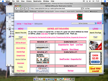
I was trying to find Domino's Pizza coupons when I stumbled across this site:
DeathToComicSans

At first glance everthings fine. General informative site, full of good stuff and discounts and whatnot, but then I realised Comic Sans was EVERYWHERE! And if that wasn't bad enough there was a link to download comic Sans in case you didn't have it on your computer. Well that was the last straw, for the sake of graphic designers everywhere, nay, the world! I had to do something.

The following is an email correspondance. A reply to my latest email is pending, but will be posted as soon as it arrives.

____________________________________________

From: mondayne@gmail.com
Subject: a quick query
Date: 15 July 2005 4:31:39 GMT+10:00
To: ozfree@gmail.com

hey.. i've checked out your site OzFree... don't get me wrong, its a good idea... but I am slightly concerned with the choice of using comic sans as your font. It's not a nice font, it makes your site look crude and simple. And that's not good.... maybe try something a bit more professional and credible. Try Arial or Georgia, or even Courier,,,, anything but Comic Sans! It's the root of all evil.

Ok, thanks for the site regardless its very helpful.
Elliott


____________________________________________

From: ozfree@gmail.com
Subject: Re: a quick query
Date: 15 July 2005 7:10:51 GMT+10:00
To: mondayne@gmail.com
Reply-To: ozfree@gmail.com

Hi Elliott,

Actually, OzFree is a hobby website -- I chose the Comic Sans font to
give it a friendlier, more personable feel. It's a big site, and I
didn't want anyone to feel intimidated (hence the choice of pastels
also).

But you raise a good point -- just because I like Comic Sans, doesn't
mean it's for everyone ... I might put it to a poll!

Thanks!

Catherine


____________________________________________

From: mondayne@gmail.com
Subject: Re: a quick query
Date: 15 July 2005 7:20:57 GMT+10:00
To: ozfree@gmail.com

Catherine

I guess theres a time and a place for comic sans. But I really strongly urge you to try something else. I know I and a lot of my other friends wont even look at sites, flyers, posters, etc if it has comic sans on it. there is a real hatred amoungst graphic designers for it. PLEASE I beg you, try something else. PLEASE!!! It's not that your site is bad, or that you made a mistake, it's just that comic sans is NOT a good font. It is VERY poorly made, it's not very legible, the spacings are all outta whack, its just not good. I've heard it a million times "comic sans makes it fun" but it doesnt. It makes it unprofessional. You can have a font thats humanist (ie. not cold and stand-offish) but at the same time not utter shit.

I know there are some extreme limitations for designing for the web, there arent very many fonts to choose from, but microsoft made a giant faux pax when it included CSans in its default list in Internet Explorer all those years ago. Georgia is humanist, but at the same time well done. It offers a warm friendly style, but not at the expense of quality.

check out this site at any rate: http://bancomicsans.com/home.html (in particular check out the Statistics page and the About pages.)

I'm sorry to pester. But I feel compelled. I know it aint any of my business, and I didnt mean to meddle, but I really think itd benefit you (and the rest of humanity!) if you used something else.


From the melodramatic Elliott


Oz Free 

------------------------------------------------------

to me
Hi Elliott,

I'm completely open to suggestions with OzFree when it comes to new
links, dead links, or stylistic changes, so please don't apologise.

I've put a minipoll up on OzFree tonight ... yes, using a pop-up
window which I *know* is a terrible thing, but in the past I've seen
that it's the ONLY way to get my visitors to answer a survey that
doesn't offer monetary compensation!

I suspect that the majority of responses will favour your suggestions,
and even I noticed that, when compared alongside the two you
suggested, Comic really does just look like a messy Arial.

But I'll see what the results say, and make the changes as requested
by respondents.

I just wanted you to know that you weren't just "writing into the
ether" -- I *am* listening to what you say!

Oh ... and I'm not sure if the BanComicSans website is yours, but for
what it's worth, the images on the left of that page don't have
"alt-tags", which makes it slightly tricky for people like me who
browse with images turned off by default.

This would affect a far smaller percentage of the population than the
Comic Sans on OzFree, but I just thought I'd mention it.

Cheers,

Catherine / OzFree


________________________________________________

Ok sure, it's not my place to say anything, but quite frankly I think a simple font change would dramatically improve the site. PLUS it'd be interesting to see what she says. And it's a funny post. Fingers crossed. Here's hoping she doesn't hunt me down like a dog.

I'm Elliott Scott, if you take the letters from my name you can spell ELITIST, signing off.

PS. Yeah, you'd have to use my middle name Levi...

Thursday, July 14, 2005

A LITTLE EXPERIMENT

Hey guys, I'm just letting you know that I'm trying out the Google AdSense program. Basically the Google dudes + dudettes read my site, and assign advertising based on content. So yes there will be ads on here, BUT in theory those ads should be related to the content. Which is nice. If in theory I'm talking about smurfs or something, then maybe some smurf related ads will be featured. I see it as more a tool than a hinderance. If I end up hating the ads though, I can always remove them.

Don't worry I won't be pandering the the Google overlords. The same ol' useless crap will still be making an appearance. HOORAY!

Thanks for putting up with me.
Oh and also if you wanna click on any of the ads, feel free to, they are REAL ads, not just for show..

Elliott Scott
Editor in Chief
Mondayne Web Log
Interweb City

ALONG THE SAME LINES

Hey I totally like inspired myself... like.... um.. today with the image I posted earlier (ie. the post below) Anyway i've been trying to do the QCA shirt for... uh... QCA but I couldn't get it right. The idea I had was gonna be pixelrffic but the people in charge of it all (ie. Paul Jolly, Don Welsh, Sebatical, etc) don't like that idea, and being the ones who are in charge (ie. choosing the final design) probably should like it otherwise it won't get used. So anyway I did a new design... sorta and this is it:

QCA-Shirt-Cutout

Basically it's pretty obvious. We (the QCA students and graduates) don't have to wear suits but the other students will (ie. law, accountancy and med students). HA HA to them, and HOORAY for us. Unless you like suits, but that's another post.... At any rate it's kinda literal and obvious but I generally like it. I will be funking it up (ie. making it more funked-up) in the NEAR future, like right now probably but in case I get lazy, you can have a look at my half-finished shizzle ma'nizzle.

ie. Sso