
THIS IS FOR _YOU BUDDY - UPDATED!!!
I was trying to find Domino's Pizza coupons when I stumbled across this site: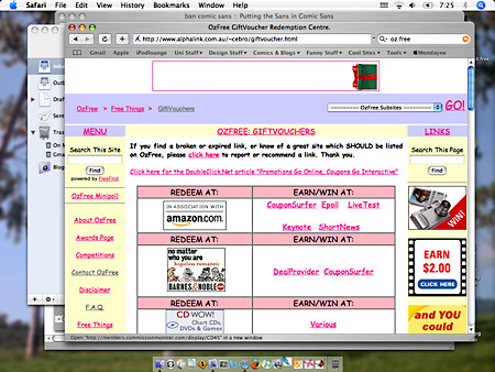
At first glance everthings fine. General informative site, full of good stuff and discounts and whatnot, but then I realised Comic Sans was EVERYWHERE! And if that wasn't bad enough there was a link to download comic Sans in case you didn't have it on your computer. Well that was the last straw, for the sake of graphic designers everywhere, nay, the world! I had to do something.
The following is an email correspondance. A reply to my latest email is pending, but will be posted as soon as it arrives.
____________________________________________
From: mondayne@gmail.com
Subject: a quick query
Date: 15 July 2005 4:31:39 GMT+10:00
To: ozfree@gmail.com
hey.. i've checked out your site OzFree... don't get me wrong, its a good idea... but I am slightly concerned with the choice of using comic sans as your font. It's not a nice font, it makes your site look crude and simple. And that's not good.... maybe try something a bit more professional and credible. Try Arial or Georgia, or even Courier,,,, anything but Comic Sans! It's the root of all evil.
Ok, thanks for the site regardless its very helpful.
Elliott
____________________________________________
From: ozfree@gmail.com
Subject: Re: a quick query
Date: 15 July 2005 7:10:51 GMT+10:00
To: mondayne@gmail.com
Reply-To: ozfree@gmail.com
Hi Elliott,
Actually, OzFree is a hobby website -- I chose the Comic Sans font to
give it a friendlier, more personable feel. It's a big site, and I
didn't want anyone to feel intimidated (hence the choice of pastels
also).
But you raise a good point -- just because I like Comic Sans, doesn't
mean it's for everyone ... I might put it to a poll!
Thanks!
Catherine
____________________________________________
From: mondayne@gmail.com
Subject: Re: a quick query
Date: 15 July 2005 7:20:57 GMT+10:00
To: ozfree@gmail.com
Catherine
I guess theres a time and a place for comic sans. But I really strongly urge you to try something else. I know I and a lot of my other friends wont even look at sites, flyers, posters, etc if it has comic sans on it. there is a real hatred amoungst graphic designers for it. PLEASE I beg you, try something else. PLEASE!!! It's not that your site is bad, or that you made a mistake, it's just that comic sans is NOT a good font. It is VERY poorly made, it's not very legible, the spacings are all outta whack, its just not good. I've heard it a million times "comic sans makes it fun" but it doesnt. It makes it unprofessional. You can have a font thats humanist (ie. not cold and stand-offish) but at the same time not utter shit.
I know there are some extreme limitations for designing for the web, there arent very many fonts to choose from, but microsoft made a giant faux pax when it included CSans in its default list in Internet Explorer all those years ago. Georgia is humanist, but at the same time well done. It offers a warm friendly style, but not at the expense of quality.
check out this site at any rate: http://bancomicsans.com/home.html (in particular check out the Statistics page and the About pages.)
I'm sorry to pester. But I feel compelled. I know it aint any of my business, and I didnt mean to meddle, but I really think itd benefit you (and the rest of humanity!) if you used something else.
From the melodramatic Elliott
Oz Free
------------------------------------------------------
Hi Elliott,
I'm completely open to suggestions with OzFree when it comes to new
links, dead links, or stylistic changes, so please don't apologise.
I've put a minipoll up on OzFree tonight ... yes, using a pop-up
window which I *know* is a terrible thing, but in the past I've seen
that it's the ONLY way to get my visitors to answer a survey that
doesn't offer monetary compensation!
I suspect that the majority of responses will favour your suggestions,
and even I noticed that, when compared alongside the two you
suggested, Comic really does just look like a messy Arial.
But I'll see what the results say, and make the changes as requested
by respondents.
I just wanted you to know that you weren't just "writing into the
ether" -- I *am* listening to what you say!
Oh ... and I'm not sure if the BanComicSans website is yours, but for
what it's worth, the images on the left of that page don't have
"alt-tags", which makes it slightly tricky for people like me who
browse with images turned off by default.
This would affect a far smaller percentage of the population than the
Comic Sans on OzFree, but I just thought I'd mention it.
Cheers,
Catherine / OzFree
________________________________________________
Ok sure, it's not my place to say anything, but quite frankly I think a simple font change would dramatically improve the site. PLUS it'd be interesting to see what she says. And it's a funny post. Fingers crossed. Here's hoping she doesn't hunt me down like a dog.
I'm Elliott Scott, if you take the letters from my name you can spell ELITIST, signing off.
PS. Yeah, you'd have to use my middle name Levi...

No comments:
Post a Comment