
A BIT TOO EXCITED
Okay so maybe I'm getting a bit ahead of myself, and I already have more than enough work to do but OH MAN! I am liking this Valley Fiesta breif. YAY! Now is my chance to do all the things I love; hipster images, use of my favourite typefaces (Cooper Blck, Rosewood Fill, etc etc) and all the rest!
Yeah, sure uni hasn't actually started yet, but seriously I couldn't help myself. This one is gonna be AWESOME!
It's a bit of a beginning of the end type thing. The first assignment of the last semester. This semester is gonna kick some ass! It won't be easy though, 5 classes, a part-time job (as the in-house designer for a swanky lighting company) AND Liveworm! Whoah. BUT at the end of it my portfolio will hopefully be good enough to get a job... in NEW YORK!
It's official kids, I will be leaving Brisbania, possibly for good... Off to greener pastures as they say. First it's Dublin to visit my good friend Dermo, and then to the Big Apple. (Apple!!! They have Mac's there [sorry]) Hopefully I'd ba able to convince Dermo to come along to NY. I don't really wanna go there alone, and plus it'd be cool. He might like it. good design there, might inspire him....
Ok, that's about it for tonight. I've had many cups o' coffee, and I'm feelin' fine.
IESSO
PS. Yes, okay maybe it is a little mediocre, but its a starting point, not a finished concept. Shut yer cakes holes until I'm done, THEN you can make fun of me untill yer little cold, blackened hearts are contempt.
~~~~~~~~~~~~~~~~~~~~~~~~~~~~~~~~~~~~~~~~~~~~~~~~~~~~~~~~~~~~~~~~~~~~~
Okay, here's another concept I did tonight. I think I might use this theme of paper it seems to work for me... you may disagree. It brings things back to a real-world context (that is such a wanky thing to say I know) but it does! The Valley's got lots of flyers and shite and this draws inspiration from that. Also it works with an artist sorta theme too, in particular the image below, rather than above. I just 'bought' Corel Painter 9, and I'll try it out. The image below was done in Illustrator though, with finishing touches (ie the paper BG) done in Photoshop. I was playing around with all the different brushes in Illustrator. Did you know there was like this whole 'nother world besides the pen tool?! I did not. Anyway somewhat hip.
Lemme know what choo think. REMEMBER! Concepts, not final work.. don't be too rough. I'm sensitive. and wimpy.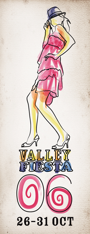
~~~~~~~~~~~~~~~~~~~~~~~~~~~~~~~~~~~~~~~~~~~~~~~~~~~~~~~~~~~~~~~~~~~~~
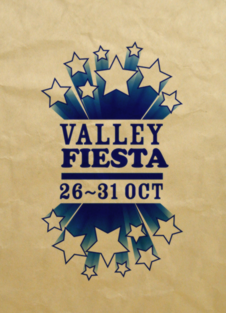
Yeah okay, this'll be the last design for the night. It's generic yes, but with some more detail, and some general good-er-ness??? it might be okay. Again, it's only a concept. I can't stress this enough people.
By the way, don't you just LOVE the stock-standard Elliott Filter TM? It rules, I know.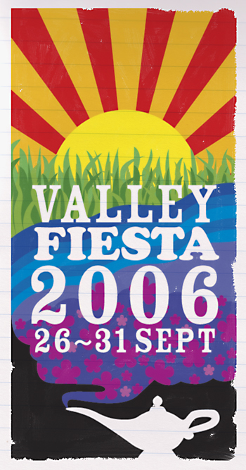
Alright there you go, 3 moderately different designs (well at least 2 anyway) At the very least can you tell me which of the three you like. Thanks.
Elliott

2 comments:
Uh, well no, it's sorta the same logo (the Rosewood/Cooper Black combination) applied to various posters of a similar style. So uh, in a way yes, but in a more accurate and correct way; no.
Does that answer your question? Probably not huh?
I don't mean to be picky, but the third has the wrong date on it... Also, I like the second one. Love your work.
Post a Comment