MY HOW YOU'VE GROWN

Still sick like a monkey. But I've been able to do a little bit of work... less and less each day though.
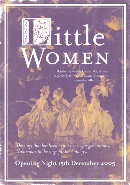
Anyway as suggested by Linus I'd added an image of a girl. Although I couldn't really find a good image on stock.xchng. But I did find a good Victorian image of 4 young women. Which at least fits the theme, even if it doesn't look the nicest.
It's a weird dilemma. Do I design for myself? Or for the brief. I don't really like this style or the style of the Titus & Andronicus poster, but they seem to fit the idea. But I don't like them...
IESSO


No comments:
Post a Comment