SHAKESPIZZLE

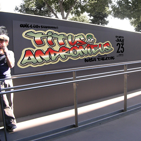
Here is a totally different concept for the Nash Theatre play 'Titus and Andronicus'. Ok, well the play isn't actually by Nash, but they're performing it. Anyway, as mentioned in a previous post (below) the play is modern and graffiti themed. So like the designer slut that I am, I adhere to this style. Except with a twist. The poster is printed on clear plastic, with a white layer under the title, which means anywhere you place the poster the background shows through, giving the effect of graffiti.
A clever idea, if perhaps not the best production values.
IESSO


No comments:
Post a Comment