
OH YEAH, I HAVE A BLOG TO UPHOLD
Yeah I'm sorry about being slack. It's been hectic at Liveworm and uni. I've got about 10-15 assignments to do by next week. Oh yeah, and I'm sick too...
Here are two of the designs I've got to do:
MOBILE PHONE LOGO'S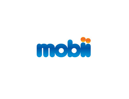
Mobii is a phone company offering basic and entry level phone packages. I developed my logo based on simple shapes, simple colors, and fun. With kids in mind. And this time in a legal sense. HOORAY!
The font I used was Arial Rounded Bold but I bolded it up to the max, altered the shape of the m, butted the letters together in the Elliott standard, and mucked around with the I's. The colors are a slight gradient, which resembles the 'Aqua' look for Mac OSX but less obvious and intrusive.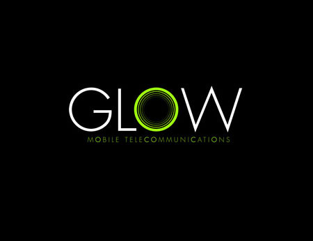
Glow is the other end of the consumer spectrum. They offer high-end phones, with all the bells and whistles. I wanted to avoid the standards of 'techno' styling, particularly blue and silver color schemes or the 'Matrix-styles' or green and black. Unfortunately I did use green and black, but it's different.
The font is Futura Light (one of my default faces) and the glowing green O. I like the contrast between the perfect circles and the harsh capital M and W's. I highlighted this difference, in the subtext.
Overall I guess I like these logo's, but at this stage I just don't care anymore. So yeah, whatever.
NASH THEATRE POSTER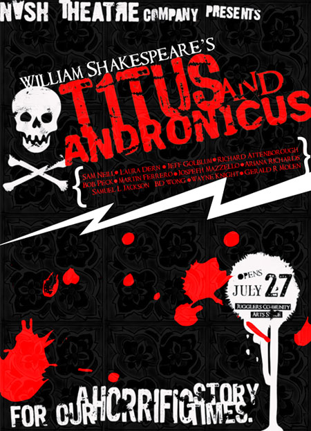
The basis of the poster is Graffiti. The play is a contemporary version of Shakespeares tradgedy. The director is using the plays base to tackle issues relating to George Bush, Tony Blair, Saddam Hussein and blah blah blah. Eyeroll. Anyway, I didn't want to put famous faces on the poster. In fact I wanted to limit the amount of graphics. WOW! Just type?!
Ok, if you don't like them, that's cool, let me know why. And I will ignore you. I mean embrace your criticisms.
Thanks
IESSO

No comments:
Post a Comment