
IMBORTANT STUFF
Yeah sure some find it boring, but its important business. I have to choose my typefaces for the comic. I like the ones with the blue stars, and also like the one with the the orange. Any opinions or suggestions would be good.
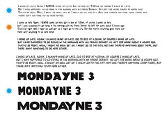
REMEMBER these are meant to look low brow. They're not meant to be perfectly produced. The tracking is way off on the bottom blue, but I kinda like that. (It's used for the title by the way)
IESSO
Ps. As I was loading the image, I thought maybe making the M or the E in 'Mondayne' out of a 3. To show thats its version, without being to blatant.

1 comment:
Lino. Yeah, that's a good idea. Thanks.
Post a Comment