
OLD TIMEY
I've been going back over some older work, revising it, redoing it, re...gaurding? it. And I decided to completely start again with the Brisbane Writers Festival. I dunno why really.. I just am. I didn't like the old one, and I removed some stuff from the folio, so it seems fitting that I put in something else, something cool.
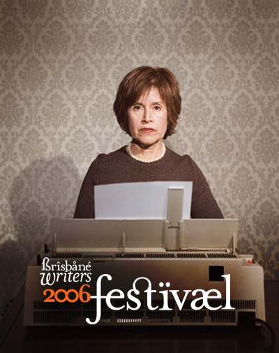
And I think this is cool. Shirley _someone will have problems with the typo, but that's to be expected. I like the image anyway, she's got the perfect look on her face. PERFECT! Except its a low-res image and it looks sh*tty up close, so I was considering buying it. Untill I saw the cost; US$175.00, so nevermind.
IESSO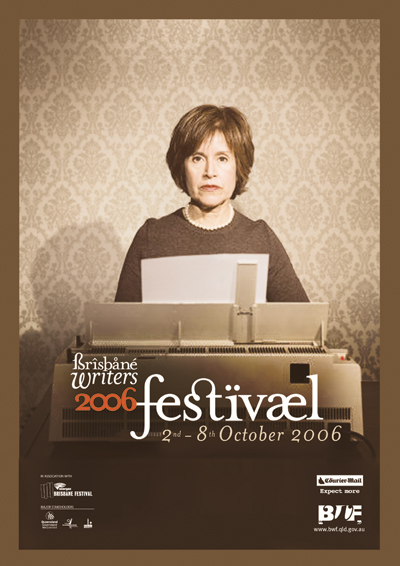
PS. Revised version. Changed the orientation to better suit the MASSIVE amount of text. Also added the brown border to give it a more old-timey retro feel, as well as avoiding stretching the image. And changed the colors to a more faded scheme. And added the logos. So basically I'm procrastinating and avoiding doing the inside section, which has HEAPS of text. And I have no ideas on how to make it all sexy. Any suggestions?
PPS. Her name is Mrs Eaves. The perfect name for a writer, named of course after the font used: Mrs Eaves. What a coincidence?!

No comments:
Post a Comment