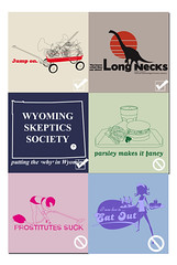
I believe it was the Beatles who said: HELP!
I heard back from the shirt people; FINALLY! They've finalised which designs they want, but with three of them they want some changes. I need some help. Seriously!
Actually I was kinda suprised too, I thought they would have chosen different designs to what they did; the 'Long Neck' one and the 'Wyoming' one aren't amoungst my favourites. I liked the 'Boom Box' and 'Bleh Shoe' and 'Pop Rock' ones. But apparently there were some copyright issues or something. Yeah right.
Well at any rate, I NEED some help with the designs for the 'Prostitute Sucks', 'Eat Out' and the 'Parsely' (which I think is fine, but anyway)
I'd like some suggestions. If you have any, whether you think they're good or not, please send them to me. I NEED them. I can't stress that enough.
LINO> I'll buy you a pizza.
Thanks so much, IESSO


4 comments:
TO: Angry, and everyone else too...
sorry, i did need to be a bit more specific. The people at the shirt place do like the concept, and the slogan, but not the illustration, or the actual design overall. For example; EAT OUT... they like the words, but maybe not the way it's written. Or the illustration. Just the idea... so if you have any ideas regarding the way it looks, or the composition or the drawing that'd be much appreciated.
And thanks Angry for your suggestion. That is the looking I was aiming for, the 50's nostalgic look. It's good... thanks.
Also... I agree with you Angry with the theory that original concept is usually best, but in some cases (most of mine) a little more thought needs to be put in. I tend to rush things a bit, and end up with unrefined works....
But at any rate, it doesnt really matter what I think; it's the ever-present, unrelenting succubus that is the client that is important. I know, I know, I am a design prostitute of sorts, pandering to their needs. but A) they're paying me and B) they're right. It does need some work.
And to answer your ponderings.. sorry, I can't pay for any ideas. I'm just way too poor. And cheap. But you'd have the satisfaction that you helped produce some t-shirt designs. And could perhaps even use that to pick of chicks/guys/inanimate objects. ??? (It's possible, I don't judge people)
Terin, that is seriously a great idea! No, really, that's awesome. I am totally gonna use that. If you don't mind. That is SSsssoooo good! Thanks buddy. That's why you're the friend, and I'm the leech!
WOW! I'm touched (sexually) that so many people responded to my cry for help regarding these t-shirt designs. It's cool. And I really appreciate it. And remember; there are never any dumb suggestions, only dumb people. I've taken all the suggestions on board, because it's the public (that's you guys) that'd be buying the shirts, so if it's what you want, I guess I should give it to you.
I'm a slut in many respects. A filthy, filthy slut. who needs a spanking. And a lolly-pop.
AS A SIDE NOTE: This post is equal #1 in regards to number of responses. WOO-HOO!!!
Post a Comment