SECOND GUESSING
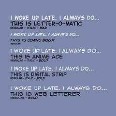
lino, for the sake of me not always agreeing with you, and you always being right (which is usually the case) i'm gonna have to disagree with you in part. i totally agree with using a blambot font, but perhaps not the one you suggested. letter-o-matic is too curvy, too fat, and it seems just not right. i thought i had downloaded it, but i actually didn't. i think i might use either 'anime ace' or 'digital strip'. i'm leaning pretty heavily to DS, i like the slant in the letters. that seems right for a comic to me.
but again; i'm usually wrong. but do continue to comment, suggest or just plain rip me to shreds as need be. i appreciate everyones comments. and without some gentle prodding with a proverbial cattle prod i would have been eating in the crap-work pastures.
i'm elliott scott, mooing off.
but again; i'm usually wrong. but do continue to comment, suggest or just plain rip me to shreds as need be. i appreciate everyones comments. and without some gentle prodding with a proverbial cattle prod i would have been eating in the crap-work pastures.
i'm elliott scott, mooing off.


No comments:
Post a Comment